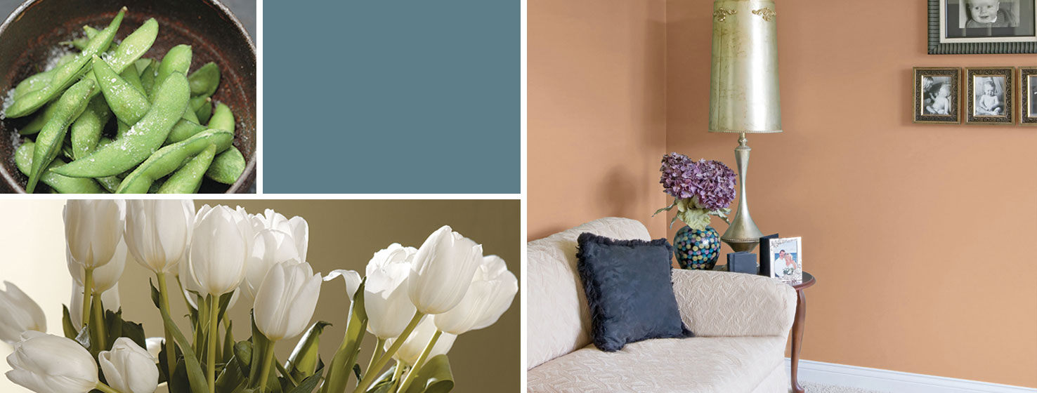
Taking into consideration the special needs of memory care facilities, this lively, rousing palette is carefully designed to help aging eyes "see" better. With a balance of warm and cool tones, these saturated colors can highlight the location of certain rooms or lead people along a "wander path."
Colors often look muted as the eye ages. Using more varied, brighter colors help residents to distinguish between spaces and find their way around.


