A spectacular setting inspires an oceanfront getaway's colorful palette and Earth-friendly design.
Susan Drawdy wanted her two-bedroom beach condo, which overlooks a neighboring pier in San Diego and the Pacific Ocean, to be colorful, but not too beach-like. No lighthouses, no shells, no netting motifs. She wanted a no-fuss, low-maintenance, high-functioning space where she and her two boys could relax and entertain on weekends.
Drawdy was too busy to be very involved with the project, so she searched the Internet for a local designer to whom she could hand it over with confidence. She chose Laura Birns, owner of Laura Birns Design in Del Mar, Calif., because of her portfolio, her way with colors and her custom furniture designs. Drawdy set no color parameters. "I let her fly with it," she says.
Birns did more than fly; she soared, creating a vibrant palette with unexpected punches of color that support the condo's spectacular view. She started with a clean, small slate: white ceramic tiles, white walls and a 1,000-square-foot footprint that could not be altered. Her challenge was making the condo look and function like a larger dwelling. But she wasn't afraid to break up the limited space with a lot of bold hues.
"I wanted the colors and the design to expand the space so you could move through it almost in a circle. I love circles," she says. "The interaction of materials and color give the condo a natural pulse."
Birns, who is passionate about environmentally friendly design, chose Sherwin-Williams Harmony® Interior Latex, which has no volatile organic compounds (VOCs). Her green leanings are also reflected in the color palette, which was inspired by nature. The front living space, which includes the kitchen, living room and dining area, has a cheerful Papaya (SW 6661) accent wall that greets you and leads you through the space. She added a deeper orange, Copper Harbor (SW 6634), and bright yellow cabinets to create a feeling of sunshine. Baize Green (SW 6429) on another wall evokes a spring meadow, while recyclable-glass floor tiles and a mosaic backsplash, both in blue, sparkle like the ocean.
"The ocean view set the stage," Birns says. "Everything else supports this natural setting."
Drawdy admits that if she had seen the whole color palette on a single board, she might have been reluctant to try so many colors. "I don't think I have ever seen a space with all the combinations of color," she says. "In the kitchen, three colors come together. It's amazing that it works, but it does."
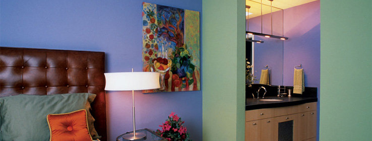
Birns continued her colorful ways in the master bedroom and bath, which feature a soft purple (Indulgent, SW 6969) and green (Baize Green) palette. "I chose purple for the bedroom because it is a good color for sleeping and dreams. I was not aware it was my client's favorite color," Birns says.
Flexible furniture pieces help the condo live larger than it looks. The living-room sofa pulls out as a queen-size bed so that the space can double as extra sleeping quarters at night. And a cocktail table, custom-designed by Birns, has wheels so it can easily move to accommodate sleepovers.
"The success of the design, in addition to the color palette, is the condo's ability to function and play host to so many people," Birns says.
Drawdy came to trust Birns' design instincts and asked her to design the family's primary residence in Escondido, Calif. That home, which is much larger, has a more neutral palette, she says, noting, with a laugh, that people usually get more conservative with color as they get older. Does Birns agree? "You should have seen me when I was younger," she says.
Colors of the sea and sun
For paint, designer Laura Birns chose Harmony®, an environmentally preferred coating with the Sherwin-Williams GreenGuard Gold certification.
Kitchen/Living Room/Hallway: Baize Green
(SW 6429) Copper Harbor (SW 6634) Papaya
(SW 6661)Master Bedroom/Bathroom: Indulgent (SW 6969) Baize Green (SW 6429)
2nd Bedroom/Bathroom: Rockwood Jade (SW 2812) Papaya (SW 6661)


