While it's generally seen to fall within the category of noncommittal neutrals, gray is really the ultimate chameleon: It aids and abets color expression like no other hue.
The color gray sometimes gets a bad rap. It's too industrial, too dreary, too bland. On the contrary: Gray, which showcases a wide range of tones, serves well as either a backdrop or an accent. What's more, gray-toned hues also are a great way to get clients thinking about color.
"In general, American adults are still very fearful of intense colors," says Susan Slotkis, an interior designer in New York City. "Even though, over the past few years, we've come to embrace more saturated color, most people are more comfortable with something toned down. Gray is a great neutralizer – it makes color not so in-your-face."
It also proves to be a satisfactory alternative to traditional neutrals. "When people repaint their homes, they're thinking about creams and beiges or other neutrals that will match their existing furniture or will be flexible with whatever they incorporate in the future," says designer Darlene Molnar of Washington, D.C. "Because gray is a modern spin on neutral, it works with a lot of different colors."
Gray offers limitless potential, but it's a color that needs special handling. Done well, gray can make a striking statement; done poorly, it can give a space a heavy, even oppressive feel. "If you use a lot of gray and use it wrong, you can get a room that is very overbearing," says designer Paul Bloom of New Haven, Conn. "On the other hand, the positives of gray are strong. Gray goes from very cool to very warm options, from taupes to blue-greens. You have all sorts of choices working with one color."
Gray can play an important role in numerous design schemes. In a dramatic black-and-white theme, for instance, Slotkis says that the color "modulates the stark, contemporary motif. Black and white can be very stoic and modern, and gray offers a more moderate approach."
For his part, Bloom finds that gray, whether it's on a painted wall or a long sofa, can create separation between two spaces in a distinct yet non-jarring way. In fact, he's so intrigued with the possibilities of the hue, he designed his own line of furniture using rift white oak finished in blue-gray tones. On several occasions, Bloom has used gray to solve design challenges. In one project, his clients tasked him with breathing some life into a tall, skinny entryway. He worked with the existing oak floors, staircase and chandelier, while finding new solutions for the front door, walls and furniture. The home's co-owner is Japanese and, because of the cultural tradition of removing one's shoes upon entry, asked Bloom to create a place for them. Bloom designed and installed a stone pad adorned with gray tones and lined in absolute black granite. For the walls, Bloom used two grays (which were one step away from each other on the color chart) featuring a dry-brush faux finish. "When morning light shifts to afternoon light to late daylight, the grays change very dramatically," Bloom says. "Gray managed to weave everything together in a marvelous way."
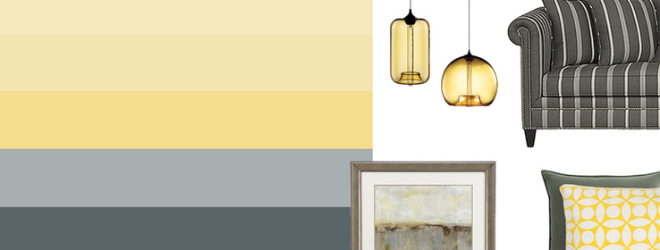
The use of a gray-based palette presents many opportunities to introduce colors, both muted and vibrant. Gray-toned hues such as periwinkle and dusty violet (translation: mauve) are popular again in fashion and, to some degree, are working their way back into interiors, Slotkis notes. On two ends of the gray spectrum, pops of yellow and blue-violet can accent a charcoal gray or slate-toned scheme, while deeper colors such as fuchsia make a bold statement against a scheme of very pale grays.
"Why not bring in citrusy colors like lime green, bright yellow or oranges?" Molnar suggests. "They work well with gray and are a great way to modernize a room and give it a nice, clean look."
Designers venturing into the gray realm should keep a few key factors in mind. "It's important to understand the different effects that neutral gray can have versus warm or cool undertones of gray," Slotkis says. "And they all don't necessarily work well together. To achieve what your client really wants, you need to understand the subtleties of the color."
Molnar agrees: "Once you identify undertones of the gray paint, you decide if you want the color of the room to be complementary or contrasting. If the gray has a tint of green, for example, you might want to look for reds and warm colors that would offer a contrast."

Image and paint color identification
Top thumbnail image: festive rug by Anthropologie.
Vertical image series: top image: Tailor sofa by Crate & Barrel. Middle image: Tempo pillow in thyme by Crate & Barrel, yellow geometric throw pillow by Home Decorators Collection. Bottom image: Providence print artwork by Crate & Barrel.
Enlarged image: Niche Pod and Niche Pendant Lights by Design Within Reach.
Sherwin-Williams paint colors depicted:
SW 6686 Lemon Chiffon
SW 6687 Lantern Light
SW 6688 Solaria
SW 6234 Uncertain Gray
SW 6236 Gray Harbor


