Clean lines, eco-friendly materials and nature-inspired hues are key ingredients in a sustainable kitchen makeover.
Rita Penrod's kitchen was at the end of its shelf life. The appliances were starting to break down, and the finish materials were getting a little stale. "It needed a fresher look," she says.
Penrod, a graphic designer, wanted the new kitchen and adjacent dining area to reflect her personal style aesthetic, which is clean-lined and contemporary. "I wanted a very sleek look, with flat lines," she said.
And as a green-minded professional who often counsels her clients on sustainable design, she also wanted to make sure her remodeling project was as low-impact as possible. So she brought in Joshua Foss of Thrive Design Studio , whose mission is demonstrating that green design can be both attractive and affordable.
"The space hadn't been touched since the 80s," Foss says. "But functionally, the layout was pretty great. All it needed was a cosmetic update."

Natural wonder
And the space had a special ingredient: A spectacular view overlooking a nature preserve in Golden Valley, Minn. Penrod and her husband are both outdoor enthusiasts who enjoy canoeing and biking, and have a deep appreciation for the beauty of Mother Nature. "We wanted to bring the natural world in," she says.
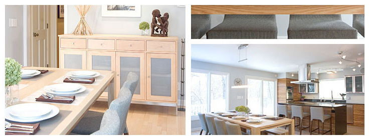
So she and Foss chose eco-friendly materials that evoked the natural landscape. They kept the original cabinets to ensure they stayed out of the landfill, but refaced them in Plyboo, a formaldehyde-free plywood product made from sustainably harvested bamboo, a rapidly renewable resource. The finish color they selected, Neopolitan, has a highly textured mix of light and dark bamboo, which echoes the wooded preserve outdoors. "We decided to install it on its side, so the grain runs horizontally," Penrod says. "It gives it a different look and helps elongate the cabinets visually." To complement the Plyboo, the cabinet interiors were repainted with Sherwin-Williams Pro Industrial™ Zero-VOC Acrylic in Cobble Brown (SW 6082).
The new stainless-steel appliances (ENERGY STAR-compliant, of course) evoke rocks and minerals, while the walls look skyward with Zero-VOC Sherwin-Williams Harmony® in a pale blue-gray hue, Misty (SW 6232). "It creates a very atmospheric quality, like the reflection of the sky in water," Penrod says.
For the countertops, Penrod and Foss chose ECO by Cosentino, a material made from 75 percent recycled materials, including glass and porcelain, set in industrial furnace residuals. They chose a dark color: black with chocolate, studded with shiny flecks from crushed mirrors. "It looks similar to quartz," Foss says. "And the bits of mirror give it a beautiful reflective value."
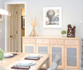
New energy-efficient lighting and a new custom-made table – built and resourced locally using harvested ash – complete the look of the streamlined new kitchen and dining area.
Penrod loves her new space. "I just like the feel of it, the sleekness," she says. And she's discovered an unexpected side benefit: "Because it's so sleek, I want to keep it very clean!"
Design is in the details
To read more about this project, visit designer Joshua Foss' blog.


