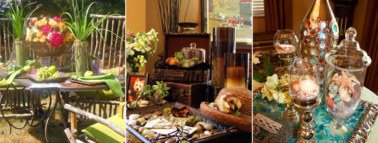
A trio of savvy stylists use Sherwin-Williams colors as inspiration for designing striking tabletop vignettes.
wondered what would happen if we invited three talented Southeast Michigan stylists to think beyond the wall, using Sherwin-Williams hues as their inspiration for creating three distinct tabletop vignettes.
Their Muse:
Three
Sherwin-Williams Lifestyle Collectionscolor palette themes — "Blissful Retreat,” "Enriched Earth” and "Artistically Bright.”
The Stylists:
Bill Hamilton of Bill Hamilton Designs, a wedding and event planning company that specializes in floral design.
Susan Keels, co-founder of Event Trender and director of sales and marketing for Royal Park Hotel.
Angela Butorac, Event Trender co-founder and owner of Butorac Events.
The trio met to discuss color and themes before heading out to various home-décor and craft stores and calling on floral sources.
The Results:
Three completely unique tabletop designs popping with saturated color, botanical head turners and clever adornments.
Setting the Scene at a Garden Party: Artistically Bright
"The woman who enjoys these colors and this setting is an avid gardener,” says Hamilton of an outdoor garden-party table replete with color amid rustic twig seating. "She's been out all morning gardening and soon her friends will arrive for a sangria-sipping brunch or lunch to discuss their gardens, flower stories and more. In fact, the watering can is still there, as she's just put it down to greet her pals.”
The starring colors in this palette — Luau Green (SW 6712), Gold Crest (SW 6670) and Juneberry (SW 6573) — show up not only in a centerpiece brimming with peonies, roses and hydrangea, but also in Brassia orchids that flank the centerpiece. They also sneak into cheerful, plaid chair cushions — note the hints of Ablaze (SW 6870) in the cushions — fruit, linens and dishware.
But what's a luncheon without party favors? Hamilton found a striped wrapping paper in shades of green, gold and red that provides an idea of what striped walls in these "Artistically Bright” tones could look like.
"This actually reflects a lifestyle and how people can live with color themes,” says Hamilton. "Color is life; live it!”
Setting the Scene With Coastal Cuisine: Blissful Retreat
A tall vase embedded with a variety of colorful gems was the jumping-off point for this seaside-inspired dining vignette.
Unexpected miniature Phalaenopsis orchids in Mother Nature's own Dancing Green (SW 6716) and Lucent Yellow (SW 6400) hues bend toward hurricane glasses full of sand. Wave after wave of sun-splashed beauty appears in shells — awash with tones of Peach Fuzz (SW 6344) — chunks of driftwood, shipshape netting and blue-and-green sea glass in shades of Dancing Green and Cooled Blue (SW 6759).
Neptune (or a well-behaved Jack Sparrow) would be right at home. The crushed, coral-hued shells beneath the votives are a little accent that's a big hit. It reflects the tone Ravishing Coral (SW 6612), which was also picked up in the coordinating napkins and delectable servings of shrimp cocktail.
The vases, shells and sea glass sit within a silver picture frame (glass removed) — a found treasure that was slightly damaged and picked up for a song at a nearby craft store.
"Putting everything in the frame and right on the table was so fun,” says Butorac. The stylists also peppered the table with other dashes of silver — the votive holders, plate chargers and stemware rims all gleam like deep-sea treasures. Silver, they explain, serves as an excellent accent for "Blissful Retreat,” whether the shades are on walls or in adornments, or both.
"We didn't want to take it too far down the beach road,” Hamilton says, "but these colors are really quintessential beach.”
"So we went with beachy,” adds Butorac. Dining with friends and family can be an adventure, she says, especially when you go with a color theme. "It's all about the experience,” say Butorac and Keels.
Setting the Scene in the Foyer: Enriched Earth
A horse- and hunting-themed framed print depicting a "blessing of the hounds” inspired an "Enriched Earth” entryway scene that welcomes with rich, grounded tones.
Keels discovered small pieces of luggage — think Fine Wine (SW 6307), Gingery (SW 6363) and Leather Bound (SW 6118) — her mother's straw hat and other accoutrement for this clever resting spot that enjoys Butorac's ever-so-romantic additions of snapdragons, spray roses, eucalyptus and Queen Anne's lace, all in a sweet vase.
To further the romantic effect and add to the storied scenario, the team filled a tray with shiny stones, moss shapes and succulents. Vintage keys and postcards — casually placed on the stones as if the owner's just come in from the post — evoke a Brassy (SW 6410) meets Pennywise (SW 6349) vibe. Old glass jars and vases add to the motif.
"The well-traveled homeowner who likes these €˜Enriched Earth' hues just came home, dropped her mail and went to fix a drink before reading the postcards,” says a grinning Hamilton, sounding as if he's a director setting a scene for his cast.
Returning from a day that may not have been so down-to-earth, this warm and spicy foyer is a welcome greeting for any homeowner.
Michigan-based writer Megan Swoyer covers a variety of topics, from home décor and design to food and entertaining to fashion and the arts. In addition to writing about color and design, Megan plays with it, too, as a watercolorist.


