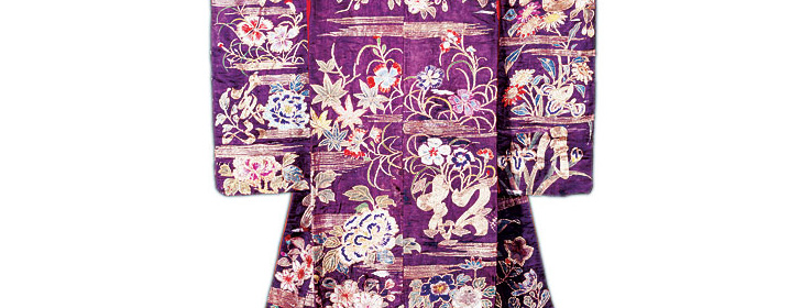
A noisy world rediscovers Japan's quiet yet powerful color traditions, along with the Eastern design philosophy of wabi-sabi.
A Tokyo streetscape seen from a racing taxi – a feverish blur of neon brights and urban grays – paints a vivid cultural image in the film "Lost in Translation."
That scene reflects the face of modern Japan to many Westerners, especially those who've experienced the culture only vicariously through movies or TV. But that image masks the culture's aesthetic essence, just as a Kabuki actor's white makeup disguises his features.
"Tokyo is so Western and high-tech, but the intrinsic Japanese culture is healthy and serene; there's a huge contrast between the city and the rural areas," says Robyn Griggs Lawrence, editor in chief of Natural Home magazine and author of a forthcoming book on Japanese-inspired home design.
Japan's true colors are not the harsh, artificial hues of a modern city but the natural, monochromatic palettes of cypress trees, tea leaves or pebbles along the shore.
"Color is very important in Japanese design, but it's very subtle and comes from nature," says Rina Okawa, a Japanese-born interior designer with Zen Associates in Sudbury, Mass.
"We always try to bring the outside in," says Shoko Aoki-Fine, an interior designer with Okohz Design Group in Redondo Beach, Calif., which specializes in Japanese-inspired design for residential and commercial clients.
Japanese color palettes include many greens, earth tones, forest colors, and beach or ocean colors, depending on the natural surroundings of the building. Stronger colors may be used for accent, but in small doses and muted shades.
"In the Japanese tradition, bright colors tire the eye," Griggs Lawrence says. "Color definition is really restrained."
This understated approach to color is only one facet of the less-is-more Japanese design philosophy. "The American way is to try to make every little space occupied," Okawa says. When a design is spare, "you (Westerners) feel like something is missing. We feel it is beautiful. We appreciate the silence, the empty space between the lines."
The calm, soothing aesthetic of Japanese design and color is increasingly sought after by Japanese and American clients alike. "There's more interest in Japanese design because everyone is so busy," says Aoki-Fine. "People's brains are stuffed with too many things; they want their homes to be peaceful, relaxed and simple."
The Wabi-Sabi Way
Its name resembles that of the fiery Japanese condiment wasabi. But wabi-sabi, unlike wasabi, is calm, soothing and serene.
Wabi-sabi is an ancient Japanese aesthetic philosophy based on finding beauty in simple, humble, aged things. Now it's having its 21st-century cultural moment, with some designers proclaiming that wabi-sabi is "the next feng shui."
Actually, "it's the anti-feng shui," says Robyn Griggs Lawrence, author of "The Wabi-Sabi House: The Japanese Art of Imperfect Beauty," published by Clarkson Potter Publishers in November 2004.
"Feng shui is all about rules," she says. "Wabi-sabi is all about intuition and lack of rules. It's about getting quiet and listening to yourself."
The wabi-sabi look is simple and uncluttered, with handcrafted items chosen not to impress but because they speak to the owner. "It's minimalist but warm – not cold, sleek white-on-white, but minimalist with a small 'm,' " she says .
Griggs Lawrence believes a house doesn't have to be Japanese in style to be true to the principles of wabi-sabi. She first encountered wabi-sabi in Maine a few years ago when she fell in love with the simple beauty of a rustic stone house that had been built by hand and furnished with flea-market finds. The owner mentioned wabi-sabi as an influence and gave Griggs Lawrence a book to read.
She believes that wabi-sabi "speaks to our needs as a society. We want to simplify, to create personal spaces, as opposed to something you could order from a catalog. When people become familiar with wabi-sabi, their reaction is 'Ah – yes.'
When Less Is More
Use indigenous materials. Robyn Griggs Lawrence is designing a teahouse for a school in Colorado, and while she plans to use natural materials, they won't be bamboo and tatami. "Wabi-sabi doesn't mean shipping in things that don't make sense for your climate."
Simplify. "Keep it muted, quiet, serene and uncluttered. Eliminate until you're down to the bare minimum," she says.
Keep it personal. "Make sure the space reflects the personality of the homeowners and includes their personal items, things they've touched, felt some connection with," Griggs Lawrence says. "Mass-produced furniture is fine, but it's not wabi-sabi," she says.
Trust your instincts. "A lot of designers have innate wabi-sabi," Griggs Lawrence says. "Wabi-sabi is just good design."


