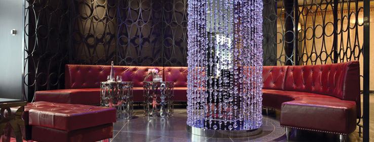
An Art Deco palette helps transform a Minneapolis landmark into a hot hotel.
Known as one of the world's hippest hotel chains, Starwood's W Hotels all have a certain wow factor, from the sleek bedrooms to the destination bars. While each one is designed independently to reflect its home city, the brand holds a common thread with recognizable features and a signature color: an inky hue that makes for moody hallways and memorable getaways.
For the new W Minneapolis-The Foshay, creating an iconic yet independent interior was a little tricky. The Foshay Tower, erected in 1929 and modeled after the Washington Monument, was once the city's tallest building. It's listed on the National Register of Historic Places, posing an immediate design challenge to preserve its distinctive character and place in the Midwestern urban landscape.
"We never wanted to lose the essence of how important the Foshay is to Minnesotans," says principal designer Alessandro Munge of Toronto-based Munge Leung Design Associates. "The last thing we wanted to do was put the kibosh on it."
Instead, Munge set out to celebrate the building's glory, drawing inspiration from its original heyday.
"I played off the imagery of the Roaring '20s," Munge says, pulling from the mystique of underground speak-easies, along with the "glitz and glam" of that era. The look fit the architecture of the 447-foot tower, but it also had to mesh with the W brand and tone.
"The colors we chose had to be sexy," says Munge. "You expect people to have a good time at the W."
In addition to using the signature W colors, Munge rounded out the palette with hues inspired by the building's original Art Deco color scheme of golden tones, blues and ocher.
Stephanie Kohnen of painting contractor Swanson & Youngdale recommended Sherwin-Williams Duration Home® paint, in 10 custom-mixed colors, for the project. "We wanted a product with superior durability," she says. And since one prominent color in the hotel is nearly black, Duration Home ensured adequate coverage.
Munge achieved the bluish-purple hue that is so recognizable in W hotels by "tricking the paint with lights" (see below). He also used this technique with whites and grays in the 230 bedrooms, creating flattering shadows.
There are Art Deco-inspired design nods all over the hotel. Large glass front desks are modeled after vintage perfume bottles, then softly lit to create a glow through the faceted glass. Gray tones and metallics throughout the hotel evoke gangster gunmetal, while one of the bars is dubbed Prohibition.
With original drawings in hand, Ryan Companies' project manager Scott Casanova and developer Joel Schurke brought several parts of the building back to their original state. While working in the ground-floor arcade, they opened up drywall to find the original Art Deco ceiling. Though it was damaged significantly, the Minnesota Historical Society and National Parks Service required that it be restored. With the help of a historical consultant, Charlene Roise of Hess Roise, the team was able to make molds of the plaster and repair the ceiling. And after a microscopic paint analysis, the original colors of mostly earth tones were matched to repaint the ceiling's intricate floral designs.
Nearly all of the building's original architectural materials remain in place, including terrazzo floors, Italian marble, African mahogany, iron and brass. The team was able to save 90 percent of the original flooring, and the nickel-plated elevator doors were salvaged, requiring code modifications, but resulting in a unique, time-honored look.
Now approaching its 80th birthday, the Foshay is ready for a big celebration. Chances are the restored observation deck will once again become a hotspot for taking in sweeping city views. And guests in search of the unmistakably modern W experience will also get a history lesson steeped in the color and character of the 1920s.
It's a fitting and sophisticated upgrade for the legendary Foshay, which had lost its luster after several earlier renovations, Casanova says. Before the most recent makeover, it was "less-than-classy office space." Now it's a showstopper. "When people walk in, it's unbelievable."
Playing With Light
Designer Alessandro Munge achieved the vibrant bluish-purple hue that is signature to the W brand with the help of lighting. The technique, he says, works with any shade, even white, as long as you can cast a shadow. By "tricking the paint with lights," shadows intensify color and create mood. He offers a few pointers:
Select a color that reacts well under a colored gel with incandescent or fluorescent lighting. For the W Minneapolis, Munge picked a custom blue from Sherwin-Williams and then relied on light to achieve the shade he wanted.
Manipulate the color with the light. Munge used colored gels and dark lenses to deepen and intensify the blue in desired areas.
Expect a trial-and-error process. In this case, contractors provided mock-ups for testing purposes until they were able to get the desired results in the hotel corridors.


