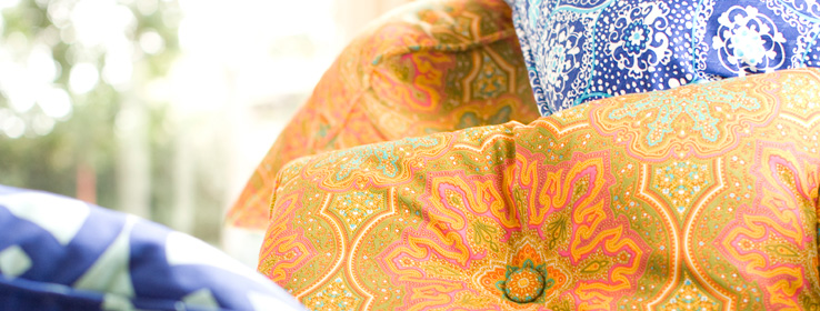
Fashion designer Trina Turk channels the modern silhouettes and sun-drenched hues of her native state.
Trina Turk's mother taught her to sew when she was 11, and from then on she was hooked. "I thought it was the most exciting thing ever," she recalls. Her early designs for herself eventually led to a career in fashion and, in 1995, to launching her own label, an empire that now includes ready-to-wear; swimwear; a residential line of rugs, pillows and tabletop textiles; and a home fabric collection, Trina Turk Indoor Outdoor for Schumacher.
STIR: How would you describe your brand's color identity?
TT: Color is just part of the DNA of our brand — strong clear color and strong graphic prints. My favorite patterns reference the late '60s and early '70s. What makes a print interesting is the play of colors against each other. There are no ugly colors, only bad combinations. You need something to ground it, neutrals and tonalities, so you have a high and low depth to the print.
Certain colors are my favorites. I always return to acid green chartreuse. It can make the difference between a print appearing dull or vibrant. I like hot pink, coral magenta, tomato red and pinky coral. Our business cards and shopping bags are an acid yellow color with a teeny tinge of green. Our first retail store was in Palm Springs — it's very sunny. Glowing yellow evokes the bright sunlight you see in southern California.

STIR: How do you approach color when designing clothing vs. home products?
TT: We started off as a women's ready-to-wear collection and evolved into home products. It was very organic. The majority of the prints for our home collection were previously from our ready-to-wear collection, although scale is different on a bikini vs. a sofa. Bright colors are always present. Swimwear is the brightest, ready-to-wear is in between, and home furnishings are toned down a couple notches.
STIR: You've said you're inspired by the architecture of California. What's an example?
TT: I love modern architecture. Living in LA and Palm Springs, I get the opportunity to see a lot of great buildings. We just did a group inspired by the Sea Ranch Lodge on the Mendocino Coast. There's a lot of weathered barnboard, and the forest comes up to the ocean. That group is more of an esoteric connection. One specific literal motif is the Palm Springs block, a concrete block square within a square. You see it in screen walls in front of houses. We've incorporated it into a million things: hardware on swimwear, jewelry, patterns on shopping bags. Sometimes it's just one, sometimes it's repeated, as it would be in a building.
STIR: Why did you choose pink for your flagship store?
TT: The inspiration was the Art Deco Bullock's department store in Los Angeles. It had a really ladylike, Old World vibe and a lot of pink blushy color. The mirrors were tinted peachy pink. It's an extremely flattering color on people's skin.
STIR: How has technology affected your designs?
TT: In a million ways. When I first started, all prints were done and repeated by hand. The only way to print was screen or roller painting. Now everything is done on computer. With digital printing, we've gone from having limitations on color to no limit — a print could have 200 colors in it. Part of what defines our brand is the print style of the late '60s to early '70s, though. We want to embrace technology, but we don't want to lose our brand identity.
STIR: How has technology changed your business in general?
TT: In so many ways. You used to see physical samples of buttons; now it's all through the Internet. It speeds everything up. The fashion business has always been notorious for its crazy pace, and now that cycle is even crazier. Change is inherent to our industry. We just have to embrace it.
Kim Palmer has been a contributing writer and the managing editor of Sherwin-Williams® STIR® magazine since 2004.


