Production designer Bob Shaw recreates palettes of the past for stage and TV.
Don Draper's office in "Mad Men.” Tony Soprano's Bada Bing strip club. The deco chic of "Boardwalk Empire.” Bob Shaw has created the look for some of the most iconic shows on stage and TV. From the 1981 Tony-winning revival of "The Pirates of Penzance” with Kevin Kline and Linda Ronstadt, to ABC's new '60s airline drama "Pan Am,” Shaw is the go-to guy for period design. Here he talks color, computers and why some designers shouldn't drive.
STIR: How did you reconstruct the palette for 1920s Atlantic City for "Boardwalk Empire”?
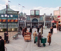
BS: There's no shortage of photos — but they're all in black and white. Atlantic City has a different feel than New York or Chicago. There's a lot of intricately carved woodwork and architectural detail; very rarely do you see things painted. My research was almost like archaeology. I found bits of old paint on old columns, color on tiles — there were a lot of blues and aquas. Certain colors weren't part of this world, like heavy reds and burgundy. People who remember the boardwalk say we got it right.
STIR: How do you use color to help define character?
BS: The lead character, Nucky, lives in a penthouse. His palette is the lightest and airiest. It's all creams and blues, like floating in the clouds. Jimmy (Michael Pitt) and Margaret (Kelly Macdonald) live a more workaday existence. They have a beach-y palette with earthier tones. We also modify colors a lot. You pick the base color and then age it up with a liquid glaze, like a doughnut.

STIR: What impact does working in television have on your color choices?
BS: We use darker colors than in everyday life, because it's all about drawing attention to faces. Rooms shouldn't pull focus.
STIR: Is there an app that would make your work easier?
BS: I needed it last week! There are computer programs that translate colors into PMS, which are usually print colors. But I work basically in house paint. I would like an app that translates house paint into something I can pick on my screen. [Editor's note: Sherwin-Williams ColorSnap® to the rescue!]
STIR: What's the trickiest aspect of recreating period color?
BS:You may think "Pan Am” just means teal, but the company used more than one blue. The aqua on the ticket folders is different than the blue of the flight bags, which are different from the uniforms. But you can't have everything on screen be blue! We've used a lot of neutrals because the wrong interaction of colors really throws things off. When you put certain colors together, they start pushing each other in different directions. It's kind of crazy.Color theorist Mary Buckley told me she stopped driving because she kept trying to evaluate the shadows along the highway and nearly went off the road. The whole world was color for her. I'm a little more casual.
STIR: What colors do you live with at home?
BS: The Pazzi Chapel in Florence is one of the most peaceful places I've ever been. It has these very pale, warm gray walls. The coloration of that space stuck in my mind, and my apartment in New York is a similar color.
STIR: Where do you get your color inspiration?
BS: One of the exercises you have to do in art school is crumple a paper bag and paint it. Everybody reaches for black and gray to paint the shadows. But shadows are almost never gray. That was a revelation to me. At a certain point, you see the color in the shadow is blue. Or green. When something clicks, you suddenly start seeing differently. It's almost like hallucinating. That's why Mary Buckley stopped driving.


