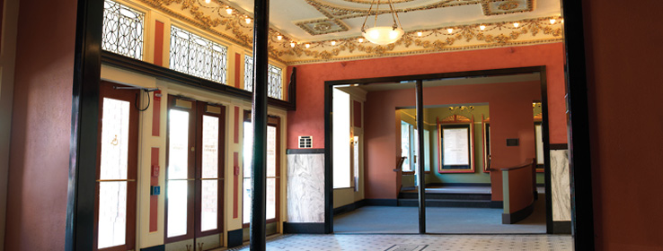
Bright hues enhance healing at a California physical therapy center.
Physical therapy can be daunting. Following doctor's orders to visit the therapist's office – where a white-clad clinician prods a knee recovering from replacement or pushes and pulls an over-used shoulder – can feel like volunteering for torture.
When physical therapist Pam Wain went to design her new Flex Physical Therapy and Fitness Center in Oakland, Calif., she wanted to create a less threatening and more encouraging space."I wanted a place that patients would want to come back to," says Wain. She turned to her architect-husband, Pierluigi Serraino of Anshen + Allen in San Francisco, for help.
"There is usually a sort of bleakness in physical therapy studios," says Serraino. "It is never about the celebration of your recovery."
"My wife is a very cheerful person and has a lot of wonderful energy," he adds. "Color was a way to create a lively space" that would reflect her attitude.
Employing a modernist design with color inspiration from the popular animated film Finding Nemo, Serraino produced an unexpected and celebratory design by washing the 3,200-square-foot space in deep, jewel-toned healing colors – nearly 20 different ones in all.
Entering through the square gray exterior, patients are greeted by a deep-red entry – and it doesn't get any more subdued as they move through the space to do the work of healing. Colors delineate land-based Pilates physical-therapy and aquatic-therapy spaces and create boundaries for patients working hard to recover.
Uplifting Palette
The windowless pool area is bright and uplifting with walls painted in produce-fresh colors including Sherwin-Williams Kiwi (SW 6737) and Vegan (SW 6738), and anchored by strong Tanager (SW 6601) at the floor – all in epoxy finishes to withstand the moisture. Changing-area doors are painted in perky contrasting colors. The land-based Pilates area is awash in sunny yellow.
According to Wain, the vibrant healing colors reflect not only an attitude, but also a regard for clients that is often missing in health care. A drab design, she says, does nothing to inspire clients to heal or to show them that you care. "Physical therapy is often very serious," says Wain. At Flex, the goal is to inject a little fun into the experience – and the environment.
Healing colors were purposely chosen to create a mood of energy and optimism. "They are very strong and very saturated," meant to be invigorating rather than soothing, Serraino says.
Still, he didn't want the bold environment to overdo it. "You have to be careful so that the colors don't become overwhelming."
The carefully chosen, cheerful design is a big hit with her patients, Wain says. "People are shocked; they just love it."
Ericka Rodriguez, office manager at Flex, also reports positive responses. "I had one patient who was really grumpy on the phone," she says. Once the patient arrived and saw the colorful space, her attitude changed completely. "She walked in, and she was like, 'This is just an amazing place.'"
Flex staff members benefit, too. Rodriguez says she used to dread going to work each day, but no more. "[Flex] is such a different environment; it is so bright, and the colors just cheer me up. It changed my whole attitude toward work," she says.


