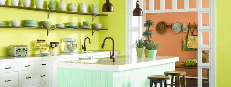
Should third place colors be the first ones you consider?
There's a saying: No one remembers who came in second. If that's true, third-place finishes must be completely off the radar. However, in terms of the color wheel, tertiary hues — those colors made by combining primary and secondary colors — are often the most memorable and certainly elicit the strongest response — both positive and negative — in my clients.
I think introducing tertiary colors is a great way to get clients thinking outside the box when it comes to paint selections and possible color combinations. It also forces people to talk more specifically about the colors they want, and that makes a designer's job easier. In the book The Comfort of Color, author and artist Susan Sargent writes: "Say ‘orange' and people see either the roof of a Howard Johnson motor lodge or the color of a clown's wig, and they are not inspired by the thought. Stick to the real words, words like saffron, persimmon, cider, cinnamon and russet , and the reception is always positive."
So, with that in mind, here are four terrific tertiary hues I think deserve a first look:
Coral
Also referred to as apricot, salmon and peach, coral is one of the most dramatic colors in nature, and maybe the most misunderstood. Personally, I love to see dark furniture against a coral wall color, but many people only associate this color with interiors that have a nautical theme. I realized this a while ago when I wanted to paint the tray ceiling in my clients' master bedroom with a coral hue. At first, the couple was hesitant because they said that they didn't want the room to look "beachy," but I argued that this color also represented the sky at dawn and dusk. Finally, one early morning I decided to snap photos of a vibrant peachy-pink sunrise. When I showed the photos to my clients, they were immediately sold on the idea of having a coral ceiling. It turned out beautifully!
Sherwin-Williams coral hues include Animated Coral (SW 6878), Ardent Coral (SW 6874), Ravishing Coral (SW 6612) and Quiet Coral (SW 6614).
Turquoise
Also known as aqua and teal, if there is a color that reigns supreme among the tertiaries, it's turquoise. Named Color of the Year by Pantone in 2010, turquoise has consistently appeared in new paint collections, and it remains a favorite of homeowners. Erin Olson knows this first hand. Olsen not only authors the popular design blog House Of Turquoise, she also operates Everything Turquoise, which features stylish turquoise-hued items from around the web that you can link to and purchase. Oh, and did I mention that turquoise is her favorite color?
"I think turquoise has such staying power because people gravitate towards its calming influence," says Olson. "They want their home to be a refuge from their busy lives, and what better place than to unwind than in a pretty turquoise room? Also, it helps that the color is gender-neutral. Both men and women seem to like it and it's perfect for either a boy's or girl's room."
Olson says she's seeing a trend with people pairing turquoise with earth tones, but she's discovering that green is also a popular partner. "It provides a very fresh, invigorating feeling … like a lovely spring day," she says.
When it comes to purchasing trends, Olson says that kitchen items are the hot sellers on her website. "People are buying a lot of turquoise utensils, cookware, mixers and blenders. These items are a great way to update your kitchen on a budget."
Sherwin-Williams turquoise hues include Nifty Turquoise (SW 6941), Biscay (SW 6940), Aquarium (SW 6767) and Synergy (SW 6938).
Chartreuse
I've read there are two types of "green" people: those who prefer blue greens, and those who favor yellow greens such as chartreuse, lime, wasabi and acid green. Many children and teens love the idea of having a bright yellow-green room. Manufacturers are also using this color for products targeted toward a younger crowd. While chartreuse is definitely a youthful hue, I'm also seeing more of it in grown-up, contemporary spaces. I recently blogged about the appeal of yellow green and, while most people responded favorably, one reader described the color as "baby diaper green." That's quite a description, and it certainly validates how personal experience factors into color preferences.
Sherwin-Williams chartreuse hues include Humorous Green (SW 6918), Center Stage (SW 6920), Electric Lime (SW 6921) and Fusion (SW 6919).
Periwinkle
This purplish blue is one of my faves. It was also the favorite color of a client I once worked with. She literally painted most of the rooms in her home with the lighter, cool blues from Sherwin-Williams color strip number 116, and she couldn't have been happier. Lighter shades of periwinkle are very ethereal and calming, so they make great color choices for spas and even doctor's offices. I've also found that these icy blues are a great way to cool down a space that gets tons of sunlight, such as a room with a southern exposure.
Sherwin-Williams periwinkle hues include Dahlia (SW 6816), Awesome Violet (SW 6815), Indulgent (SW 6969) and Hyacinth Tint (SW 6968).
I enjoy introducing new and unexpected colors to my clients. And, of course, there are hundreds of other tertiary colors and all the variations that go with them. Through discussing and considering such specific colors, people can better understand and describe their own color preferences and biases, which makes the design process more effective and enjoyable for all involved.


