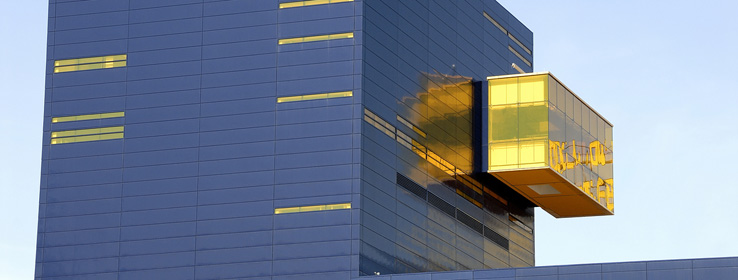
A look at how Jean Nouvel, the architect who designed the Guthrie Theater in Minneapolis, embraces color in his projects.
One of the benefits of being an architect living in Minneapolis is the city's rather impressive roster of buildings designed by name brand "starchitects." The city collects them like my mother-in-law collects Hummel figurines — adding no more than one or two a year, and avoiding duplication.
In the last decade, for example, the following international headliners have added the following to our urban landscape: an expansion to the University of Minnesota's College of Architecture and Landscape by Steven Holl, a Frank Gehry museum, an art gallery addition by Herzog and DeMuron, a Cesar Pelli library, a rock-shaped Antoine Predock alumni center at the University of Minnesota, a small Maya Lin winter garden, and — breaking the rules — two Michael Graves additions, one for theater and one for art.
To be or not to be
The popular favorite of the influx of new buildings, and arguably the most iconic for the city, is the 2006 Guthrie Theater by French architect Jean Nouvel. Located on a prominent site overlooking the Mississippi River and Saint Anthony Falls, the Guthrie is notable for its solid blue mass, and the "endless bridge" — a jaw-dropping cantilever that offers theater patrons unmatched vistas of the river. The crisply detailed blue metal panels were a clear departure from neighboring historic grain elevators and mill buildings, most of which have now been converted into luxury condos and decked out in plain grey concrete or sheathed in anonymous beige bricks.
Nouvel, who often attended public meetings in Minneapolis wearing black leather pants, is not known for politely fitting in, nor is he hired to do so. Yet his brash insertions into existing urban environments are not born of disrespect for or a snub of what came before. Rather, he uses differences to bring greater meaning to a place. Speaking to The New York Times shortly after winning the Pritzker Prize in Architecture in 2008, he said: "Generally, when you say context, people think you want to copy the buildings around, but often context is contrast." Nouvel added: "The wind, the color of the sky, the trees around — the building is not done only to be the most beautiful; it's done to give advantage to the surroundings. It's a dialogue."
Not color-shy
Unlike most contemporary architects practicing today, Jean Nouvel embraces color in his work, often in an overt and painterly way. Whether it's the pixilated and polychromatic Agbar Tower in Barcelona, the hot and rusty red gallery boxes of the Mus+¬e du Quai Branly in Paris, or the sky blue roof of the Genoa Trade Fair Pavillion, Nouvel's use of color is neither timid nor superfluous. It is as inherent to the concept of the building as is its shape, plan arrangement or use of daylight.
At the Guthrie, Nouvel's choice of a dark blue for the building exterior grew out of the idea that, as the sun sets, the practical concerns of the day give way to the fantastic imaginings of the theater — the dark blue of the building merging with the dark blue of the sky. Taking the idea a step further, he scattered screen printed images of the theater's past — primarily costumed characters from notable productions — around the building exterior, using a blue one shade lighter than the primary hue. During the day, the images disappear against the highly reflective surface of the metal panels. At night, it's the metal panels that disappear into the night, and the ghostly images emerge, thanks to strategically placed light fixtures.
The inside of the building brings additional color surprises. A notorious night owl, Nouvel ensured the lobbies and hallways trend dark, with black leather furnishings and smoke glass mirrors befitting any chic Parisian nightclub. In the main stage theater, an explosion of oranges, reds, and crimsons cascade from the nacho-chip shaped ceiling tiles and across the confetti pattern of upholstered theater seats. Red, the archetypal color of the grand halls of Europe, is used in its uncut form in the smaller proscenium theater. Rather than heavy bolts of rich velvet, here Nouvel used red anodized aluminum coil drapery to dress the sidewalls, which are made even redder by a wash of red LED cove lighting.
Making a statement
To get the best views of the city, however, you need to take the elevator to the top floor, to the true-to-form "black box" experimental theater. Ten floors above the street, and poking out of the side of the building like a mislaid Jenga block, the floor-to-ceiling glass lobby is no place for acrophobes. Perhaps the most willfully idiosyncratic feature of the building, the room is wrapped in golden yellow glass. Nouvel has stated publicly (or joked publicly; it's not clear) that the yellow glass, like those in ski goggles, will make everything seem warm and happy. Whether it's a sly commentary on Minneapolis' harsh winters, or an indulgent fun-house trick, the yellow lobby is a "must see" for any of my out-of-town guests.
While I know many architects who avoid color for fear it will upstage their more serious manipulations of form, space and lighting, I also suspect they avoid color because they doubt their mastery of it. I find it refreshing that there are contemporary architects like Nouvel, and like the modernist progenitors Mies Van Der Rohe and Adolph Loos before him, who see color in architecture not as an afterthought, but as a primary means of expression.


