By Beth Rutledge
Meet Minneapolis-based tile artisan Roger Mayland. He and his team have been crafting custom ceramic tile at his North Prairie Tileworks studio for more than 20 years.
Name: Roger Mayland
Occupation: President and artisan, North Prairie Tileworks
Notable Projects: New tiles in the Nelson Cultural Center at the American Swedish Institute in Minneapolis, Minn.; replication tiles in the Thomas Wolfe mansion in Asheville, N.C., and in the entrance stations at the Lake Mead National Recreation Area in Nevada.
Roger Mayland's handmade tiles often display colors crafted to mimic the patina of antique tiles, and he's frequently called on to contribute to restoration projects (Roger has become particularly renowned for his Arts and Crafts work). Each North Prairie Tileworks glaze is painstakingly created, and the company's tiles have found their way into homes, museums, universities and public buildings in the U.S. and Canada. Settle in to learn more about Mayland.
STIR: How do you describe yourself as a designer?
Roger Mayland (RM): A student of the Arts and Crafts movement. A seeker of discovery, and a collaborator with my clients and staff.
STIR: You work with color every day. Do you find your personal preferences making their way into your designs?
RM: My specific preference is for a clean design using natural colors, rather than a bias for a specific color. Because we are artisan-driven, we typically take our cues from our clients, since we're always trying to personalize a project for them.
STIR: Where do you find color inspiration?
RM: Inspiration for color comes first from all the glaze testing that we are always conducting in our restoration work, and second from the Arts and Crafts tile makers of the past.
STIR: What appeals to you about the Arts and Crafts style?
RM: Part of the overall appeal is that Arts and Crafts is practical. Its designs are made to be used and enjoyed, and it should be beautiful and look clean. In terms of colors and designs, it's about all things natural. The flowers, animals and colors — lots of browns and greens — are inspired by nature. Arts and Crafts tiles often show frogs, turtles and fish. And dragonflies; they're at the top of the heap.
STIR: You mentioned "glaze testing." When and why does glaze testing become part of a project?
RM: When a project requires close color matching, that's when we test. Essentially, we're trying to create the closest possible match to the original. We have a glaze library that has come together over the years, and we consult our library for colors and recipes. But there are many variables that contribute to how tile will look.
STIR: What are some of those variables?
RM: Length of time in the kiln, temperature in the kiln, what the tile is made of. There are a lot of differentials we consider when trying to create a specific color. And when we're working on a project that requires replication, we get to see the old tiles and try to unlock the secrets of how they were made.
STIR: How do you and your staff approach a typical project?
RM: Well, all projects we do are unique in their way. We pride ourselves on celebrating the arts and creating functional artwork. But we approach our craft as artisans first and artists second. We're here to create something specific, and all of our relief pieces are driven by our end user. Sometimes they just want to know, "Can you match a fireplace tile?" And sometimes they want us to make a suggestion about what would look right on a bridge or a fountain or an old building.
STIR: Although many of your projects are for historical features, your business is probably not immune to trends, is it?
RM: There are trends in tile, sure. Tile actually started to get big in America around 1885, when the public health movement took off. White became the prominent tile color in kitchens and bathrooms. There was an ad in Good Housekeeping about white, sanitary, easy-to-clean tile, and white tile began showing up; you'll see a lot of subway tile in houses from the turn of the century. (Incidentally, the old subway tiles of the 1880s and 1890s have a talc clay body and today would have fine cracks in the glaze.) Color had its place, but white has been the predominant tile color for years. Only in the last five years or so have we seen color take market share from white.
STIR: So, what is a popular color today?
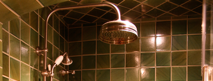
RM: Green is number one. There are so many variations of it in nature. It's a strong color, but very versatile. It can be used in contemporary or historic settings.
STIR: Speaking of contemporary life, demolition is common now, yet your work has helped keep several historic buildings faithful to their original style. Why is restoration important?
RM: A business may own a building for ten years, but that building could be around for a century or more. We need to be better stewards of our history. In the restoration projects we do, we know what's original and what's new. Hopefully, the only thing others see is beautiful tile.


