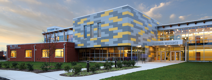
This colorful educational facility was designed from the ground up to provide a fresh start for an entire school district in Pennsylvania.
By Joann Plockova
The first day of school offers a fresh start for every student. For the lucky students of Pennsylvania’s Bristol Township School District (BTSD), the first day of school becomes an opportunity to begin anew in three schools simultaneously.
Located in Bucks County, this uniquely integrated, three-school project marked a fresh start for the school district as a whole. A feasibility study had determined that nine elementary schools should be consolidated into three to reduce operational costs and modernize facilities. Schradergroup, the architecture firm tasked with the project, devised a colorful plan. The result: the new Brookwood Elementary, Mill Creek Elementary and Keystone Elementary Schools — all housed within an innovative schools-within-a-school concept.
A New Model
“Clearly we are trying to break down the institutional model of the school,” says Schradergroup architect, founder and managing partner David Schrader. “Part of the way we do that is through finishes. They’re very important to making these environments brighter, lighter, more exciting and stimulating for the kids.”
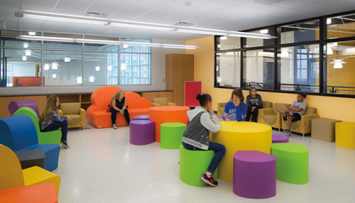
The BTSD project marked the end of an era, with students moving from nearly a dozen aging buildings into three shared, bright and colorful structures designed by Schradergroup. Divided into two classroom wings separated by a shared central core of common spaces, including the gym, cafeteria and libraries, the new 140,000-square-foot educational facilities reside in historic Levittown, one among seven planned suburban communities developed by Bill Levitt, beginning with the first Levittown in New York in the late 1940s.
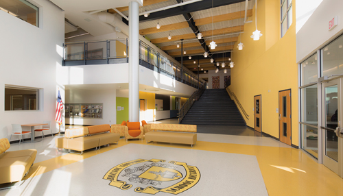
To honor that history, the Pennsylvania Historical and Museum Commission required preserving the history of three original Levitt buildings that were taken down to make way for the new facility. And a display area incorporating Levitt’s housing types and memorabilia was created on a wall at the head of an expansive learning stair. To highlight the display, Schradergroup incorporated bright blocks of color in Leisure Blue SW 6515, Parakeet SW 6711 and Anjou Pear SW 6381 that added a distinctive graphic touch.
“That became a kind of Mondrian wall that we created with the color, to incorporate all of that history,” Schrader says, referring to the famous Dutch modernist Piet Mondrian.
Along with tall windows, tons of light and soaring ceilings, color runs throughout the massive space, or as one enthusiastic student describes her new school’s scale: “Really tall, huge, gigantic and enormous and big.”
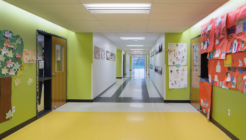
Creating an atmosphere that manages to be playful and modern, color is used to break up the space and serve as wayfinding for students who need to distinguish each of the individual schools, which all have the same floor plan.
“It was our intent to have each school the same but allow the color difference to give them uniqueness,” says Angela Nober, BTSD board president.
Beginning at the exterior, cement panels with a similar block-like aesthetic to the “Mondrian wall” mix shades of gray with either a yellow, blue or green accent color to signal the entrances to each of the schools. Those core colors are pulled into the central core and its public spaces in Leisure Blue SW 6515, Parakeet SW 6711 and Anjou Pear SW 6381, along with the dark gray accent Cyberspace SW 7060, which is incorporated into exposed ceiling beams, inner window frames, stairwells and grated railings that contribute to an industrial feel. The light putty-colored Heron Plume SW 6070 is used as the background color to the school’s colorful canvas.
“[We used] color in all of the large public spaces to kind of stimulate and enhance the spaces so they didn’t appear so large, white and bland,” Schrader says.
The Mondrian motif is pulled into common areas, like the libraries, where built-in seating nooks are painted in one of the core colors and accented with pillows in bright shades. Warming the space with wood beams and flower-like pendant lights, ceilings look down on colorful furnishings boasting creative shapes.
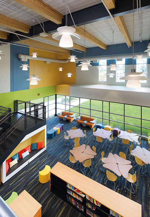
Schradergroup, respected for their impressive track record with academic facilities, presented three basic color schemes, but it was ultimately the school board and building design committee that made the final decision. “The soft-toned colors were chosen for a calm effect,” Nober says. “Bold colors can have a negative effect on some children.”
High-Performance Coatings
To ensure all of that color is able to perform, Schradergroup specified coatings designed to withstand the daily wear and tear of a busy school. On interior plaster walls and concrete masonry units, ProMar® 200 Zero VOC Interior Latex Paint was used throughout, while Pro Industrial™ High Performance Acrylic was used on metal surfaces. On the structure’s exterior, A-100® Exterior Latex Paint was a workhorse on concrete masonry units and composite wood siding, while ConFlex™ Acrylic Coating beautified and protected other concrete surfaces.
Schrader says creating “inviting, beautiful buildings that the client and user could be very proud of” was the firm’s ultimate goal in helping ensure a smooth transition.
Going by the students’ reactions, the firm succeeded. As one young student said, “I love how the color is.”


