Kim Palmer
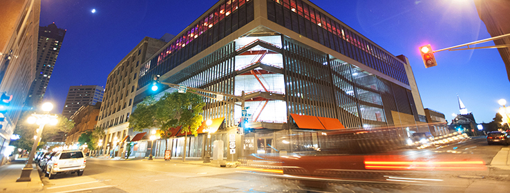
An ugly-duckling building is transformed into A’Bulae: a fairy-tale wedding venue.
When designer Ed Hawksford was first tapped to help turn a dilapidated former computer lab into A’Bulae (AH-boo-lay), a glamorous urban-chic event facility, it looked like a tall order.
“I got a call from the developer,” recalls Hawksford, principal of Hawksford Design in Bayport, Minnesota. “He said, ‘I’ve just bought the ugliest building in St. Paul, Minnesota.’”
The developer wasn’t kidding. Built in the mid-1960s, the International Style structure had originally housed an outpost of the former Control Data Corp. But the neglected building had been vacant for several years and was slated for the wrecking ball. “The roof had caved in,” Hawksford says.
Still, the new owners thought the ugly building - and its prime downtown location - offered a lot of potential for weddings and other events. Think: a little piece of SoHo in St. Paul.
Located in the city’s historic Lowertown district near the Twin Cities’ first Mississippi River port, the site had three important ingredients: opportunity for on-site parking, a rooftop area with stunning views of the city and the river, and a 30,000- foot structure that offered “a blank slate” for creating an ideal wedding venue from scratch.
“Instead of designing an event around a building, it was an opportunity to design a building around an event,” says Tim George, owner of A’Bulae and its sister company, Bellagala, a one-stop wedding planning and services provider.
Manifesto
At the beginning of the project, Bellagala consulted its vendors, from photographers to florists to deejays, and asked them what they needed in a site in order to deliver their best work. “That resulted in a 131-point manifesto, which we gave to the architect,” George says.
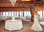
The reworked building includes all the ingredients for a modern dream wedding. In addition to a grand ballroom, a stylish bar and an industrial kitchen, A’Bulae also boasts a luxury bridal suite with eight makeup stations, and a groom’s suite, complete with an adjacent game room.
The facility is equipped with all the latest in interactive digital technology, so couples can personalize their event using live video and photo feeds displayed on flat-screen monitors, and can control LED lighting options at the touch of an iPad.
The name A’Bulae was coined to “roll off the tongue - and stand alone in a Google search,” according to George. To keep the urban loft aesthetic, the new design incorporated some of the building’s original architectural features, including its fir ceiling beams. “We blasted them with walnut shells,” Hawksford says. “It’s like sandblasting, but doesn’t open up the wood grain.”
Afterward the beams had to be sealed, but by then it was late fall, and there was no heat yet in the building. Hawksford chose a Sherwin-Williams lacquer, which is formulated to perform even in chilly conditions. “We could use it at a lower temperature” than other products on the market, he says.
Design theme
For Hawksford, who has developed a niche reviving Victorian and other vintage properties, the project presented an opportunity to explore a midcentury modern aesthetic. “I’m more known for historic buildings,” he says. “This was great fun, to do something contemporary.”
Initially, his vision for A’Bulae was to draw from the era when it was built. “I wanted to go really midcentury modern - all those funky aquas and pinks,” he says. But the wedding director wanted a more traditional look. Another stakeholder wanted all white.
“There were some competing visions at first,” George says. It was up to Hawksford to forge a compromise. “We went through several incarnations,” he says. “My biggest color challenge was restraining myself. I like bold colors.” He soon concluded that the midcentury modern colors he’d envisioned didn’t pop against the brown of the exposed wood beams. “They looked kind of muddy with all the wood, and we needed it to look fresh.”
In the end, he created a marriage of modern and vintage elements, in a sophisticated neutral color palette compatible with a wide variety of wedding color schemes.
“Ed had free rein with color and was instrumental in guiding us,” George says. “You go into some ballrooms, and there are strong patterns. We know people want to customize their weddings, so we needed colors that don’t compete.”
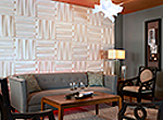
The entry hall, for example, features warm, softly elegant hues: SW 6128 Blonde, SW 6130 Mannered Gold and SW 6408 Wheat Grass. “It sets the tone,” Hawksford says.
Sherwin-Williams colors used in the A’bulae entry hall.
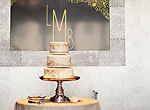
The ballroom is painted silver, a nod to all the technology built into the venue. Hawksford chose an oil-based metallic on top of a base coat of SW 6001 Grayish, - “so it would flow and melt,” he says. The bar is accented in SW 6005 Folkstone, a warm taupe-like gray.
Sherwin-Williams colors used in the A’bulae ballroom
Something blue
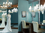
In the bride’s suite, Hawksford opted for the traditional “something blue” — slate blue, to be specific. He found the perfect hue in SW 6485 Raindrop. Meanwhile, guys in the wedding party can relax in the groom’s room, painted in a rich chocolate brown (SW 6118 Leather Bound), and its adjoining gray-green game room (SW 6423 Ryegrass).
Sherwin-Williams colors used in the A’bulae bride’s suite and groom’s room.
Something blue
Hawksford specified Sherwin-Williams Duration Home® Interior Acrylic Latex Paint for all interior walls. He became a Duration Home convert about a decade ago, not long after the premium paint was first introduced. At the time, Hawksford was working with a real estate company to renovate Victorian houses, and was in the habit of using another paint brand. His painter suggested he try Duration Home.
“He said, ‘Duration Home is going to save you and your client so much money - it’s self-priming, easier to apply and comes in great colors,’” Hawksford says. So he gave Duration Home a try and discovered that his painter was right. “Since then, I’ve been using Sherwin-Williams for everything.”
That includes the original fire escape that creates a focal point on A’Bulae’s exterior. The rusted-metal relic was exposed when a corner of the building was removed. It’s now highlighted against a backdrop of glass block and painted bright red in rust-proof epoxy.
“We took an ugly thing and turned it into a piece that’s a signature, like a hood ornament on a car,” George says. “Backlit at night, it’s beautiful and unique.”
No longer an eyesore, A’Bulae is now an asset to downtown St. Paul and a sparkling addition to its skyline. “It started with ‘What can be done with it?’” Hawksford says, “and morphed into a great project.”


