By Mary Beth Klatt
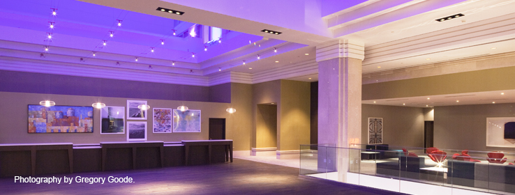
Photography Credit: Gregory Goode
STIR talks with designer Xyrus Diego about the color and design inspirations for his renovation of the Radisson Blu in Minneapolis.
Over the course of the past decade, Xyrus Diego has designed upscale hotels in Israel and New York City. He recently completed the interiors of the Radisson Plaza Hotel, now named the Radisson Blu, in downtown Minneapolis for design firm Stonehill & Taylor. His biggest challenge: to retain the nearly 100-year-old hotel's historic features, update it and give it a distinct Midwestern Scandinavian touch. Diego oversaw the renovation of more than 360 guest rooms, public areas and the restaurant. STIR caught up with the Filipino designer at his New York City home.
STIR: How is this Radisson Blu similar to other Radisson Blu properties?Xyrus Diego (XD):
The Minneapolis location represents the upscale Radisson Blu brand, where the public spaces and guest rooms are designed for guests to have a fresh and relaxing experience. The downtown location and interior design of the hotel both contribute to this. We developed the design materials and finishes to reflect the Scandinavian influence and history of the hotel brand.
STIR: Many Minnesota families and businesses, including the Radisson brand, hail from Scandinavia. Can you tell us how you interpret this historical intersection in color?
XD:
Scandinavian Design emerged mid-century, along with the modern contemporary movement. It focuses on simple, functional yet beautiful design. We created a color palette of bright, clean and natural hues in line with the movement's philosophy. We combined this spectrum with interesting fabrics and materials also reminiscent of the Scandinavian Design style.
STIR: What mistakes have you seen at other hotels with color?
XD:
I don't see them as mistakes — the design world is subjective. It all depends on the end product being well executed. In my opinion, colors that create strong contrast greatly influence connection, and craft behavior and a good guest experience throughout the designed space.
STIR: Despite having "Blu" in its name, this hotel seems to have very few blue walls, if any. It seems like there's more of a suggestion of blue, mostly with lighting in the guest room corridors. Why?
XD:
The fluidity of the blue lighting against a painted white surface is an inventive way to showcase the "Blu" concept in a non-literal approach. The correct paint color brings to life this "Blu" light, making it seem animated and in motion.
STIR: The color blue is most strongly associated with water. Is that true for you?
XD:
Instinctively the first couple of things that come to mind would be water and the sky. I tend to go with the latter, though. Water itself is actually almost colorless and reflects the general color coming from our skies. That's why we see that mixture of blue, green and sometimes clear water, which are all dependent on light and nature's way of playing with colors.
STIR: Tell us about your process. How does color inspire you?
XD:
Color is everywhere. Color is life. Our experiences and behaviors are all color-driven. Incorporating this with the design process and space planning, I'm able to bring to life the connection between the abstract [art] and reality for everyone to experience.
STIR: What kind of colors do you use in your own home?
XD:
I have subtle earth tones and pastels painted on my walls, combined with clean white. As of this moment I'm going for a "relaxed and homey" feel, with accented punches of color on furniture. Maybe in a couple of years, the colors will progress to another curious realm.
STIR: Blue is a tough color to use in a home without it seeming heavy. How do you suggest people approach this bold dark color in their own residence?
XD:
Depending on shade, use and location, blue can either be an accent or a general color. I recommend dark blues be used on a large wall, perhaps on trims. Dark blue in a small room tends to create the illusion of the space being smaller. Depending on other design aspects, bold and dark blues can be either contrasting or matching other colors.
What do you think of the renovated Radisson Blu Minneapolis? Continue the conversation with us (
@SWDesignPros) on Twitter using #SWStir.
GUEST ROOM:

COLORS SHOWN: trims:
Functional Gray
(Semi-Gloss) SW 7024; ceiling:
Requisite Gray(Flat) SW 7023
Wallpaper visually lengthens a guest room; artwork over the bed celebrates Minneapolis and its cultural ties.
GUEST ROOM - DETAIL:
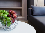
COLORS SHOWN: trims:
Functional Gray(Semi-Gloss) SW 7024; ceiling:
Requisite Gray(Flat) SW 7023
Seating, furniture and carpeting in neutral tones make the guest room a comfortable area for casual, private entertaining.
RESTAURANT:
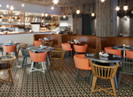
COLOR SHOWN: ceiling:
Requisite Gray(Eg-Shel) SW 7023
FireLake restaurant, which underwent a complete renovation and redesign, uses reclaimed Minnesota barn wood, homey lighting and an overall rustic elegance.
GUEST ROOM CORRIDOR:
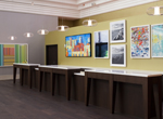
COLOR SHOWN: ceiling:
Ibis White(Flat) SW 7000
The blue lighting suggests color in the guest room corridors, bringing to life the hotel's "Blu" concept in a non-literal way.
GUEST BATHROOM:
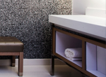
COLOR SHOWN: ceiling:
Pure White(Eg-Shel) SW 7005; door trim:
Simple White(Semi-Gloss) SW 7021
The bathroom is a picture of contrast with a black tweed textured wall and white fixtures.


