Michigan’s Mt. Brighton gets a lift, with vibrant color.
By Megan Swoyer

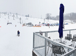
Winter came early to southeast Michigan, with a major snowfall in mid-November. As ski facility manager Taylor Ogilvie watched the flakes come down, he relished the season’s early start. And he couldn’t wait to see skiers enjoying his newly vibrant ski complex.
Mt. Brighton is now as energetic as the skiers who whoosh down its slopes — thanks to a recent redesign. In addition to new chairlifts, snowmaking equipment and other upgrades to the resort, the lodge got a jolt of bold color and modern materials, designed to make it a more attractive destination for outdoor enthusiasts of all ages.
The facility, built in 1960 and added on to several times over the years, was long overdue for an update, according to Ogilvie. When Vail Resorts, based in Broomfield, Colorado, purchased Mt. Brighton in December 2012, one of the first goals was to freshen up its dated vibe.
“I think the last upgrade was in 1981,” Ogilvie says. “It wasn’t given a lot of love; it was worn out and needed a facelift. In fact, it was either facelift or wrecking ball.”
Enter Lindhout Associates Architects, also based in Brighton.
“Lindhout had a great vision of what the facility could be,” Ogilvie says. “An architect on a ski resort project might typically draw you some sort of pseudo-Tyrolean German building that supposedly looks like ‘ski’ — but we’re in metro Detroit. We wanted more of an industrial, urban look with unique metal finishes and colors. We wanted to get away from that dark, rathskeller feel that so many ski lodges have.”
“Urban edgy”
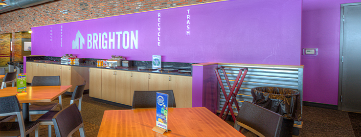
Instead, Lindhout’s Vanessa M. Fuller, Associate ASID, LEED AP, and architect/project manager Dave Richardson, LEED AP, envisioned a palette of popping purples, raging reds and great greens, plus recycled barn wood, zany variegated carpet, modern beanbag seating and cool finishes — all adding up to an ultra-urban, edgy feel.

“We saw how dark and staid the spaces felt,” Richardson says. “The client wanted to bring energy and some funk to the facilities.”
The new color selections were carefully calibrated. “We needed to consider the longtime clientele and the new and younger ones coming on board,” skiers and snowboarders, Fuller explains. A centerpiece nod to downhillers is the painted metal canopy at the entrance, which looks like an upturned ski or snowboard. For this head-turning element, painters applied orange-red Daredevil (SW 6882). That curved canopy became the starting point of expanded metal panels.

Some of the original elements were incorporated into the new design. “Vail Resorts is about keeping what they can keep during a renovation, because generations of people still relate to certain aspects,” Fuller says. “So in the Ore Creek Grille, we worked around a great fireplace and brick wall. On the exterior and interior, we had to deal with the original brick and existing entrance, so we added a new entry canopy, metal panels, quartz surfaces and carpeting, based on Vail Resorts’ marketing palette.” Fresh touches included perforated aluminum panels in the ticket area.
Interior paint colors include Repose Gray (SW 7015), Dorian Gray (SW 7017), Dovetail (SW 7018) and Urbane Bronze (7048), which all wend their way throughout most of the design, including the ticket counter, and food and concierge areas. Bright accents include Passionate Purple (SW 6981), Direct Green (6924) and Hyper Blue (SW 6965).
The kids’ area, called Mogul Mouse, features an eye-popping combo of Passionate Purple, Urbane Bronze, Direct Green, Hyper Blue, Forceful Orange (SW 6894) and Real Red (SW 6868). Lime green beanbag chairs and reclaimed-wood pigeonholes add to the way-cool surroundings.
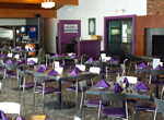
Ore Creek Grille, meanwhile, is “a more adult space — more contemporary and sophisticated, with table and lounge seating,” Fuller explains, so the team selected Repose Gray, Dovetail, Urbane Bronze, Dorian Gray and Mature Grape (SW 6286).
“We love the colors they chose,” Ogilvie says.
The team selected Sherwin-Williams ProMar® 200 Zero VOC Interior Latex for all interior walls; its toughness is especially good for commercial projects, they say. Sherwin-Williams Pro Industrial™ Pre-Catalyzed Water Based Epoxy was used in all the “wet areas, such as kitchens and bathrooms,” Fuller says. And for the exterior, the team opted for Pro Industrial™ Urethane Alkyd Enamel and SuperPaint® Exterior Acrylic Latex. “The exterior enamel provided great coverage and has held up wonderfully,” says Richardson, while the exterior latex provided “a good, cleanable surface for all the decorative panels.”
Ogilvie is delighted with the renovation. “The reception and appreciation by area skiers have been great,” he says. “People are raving about the new facility.”


