By Kitty Shea
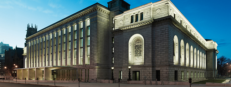
Long before the Internet, when libraries and books were the headquarters of knowledge, Central Library stood among the mightiest. The crown jewel of the public library system in St. Louis, Missouri, had imposing size — 185,000 square feet covering a full city block — and an impressive pedigree. Philanthropist Andrew Carnegie was its original benefactor, while renowned 19th-century architect Cass Gilbert was the visionary behind its Beaux Arts neo-Italian Renaissance style. The granite and marble edifice awes in a way that no website ever will. Time expands human knowledge, but does few favors for buildings, save for patina on bronze doors. As it neared its centennial, Central Library lacked high-speed data delivery, updated lighting and HVAC, handicap accessibility, fire protection — and overall panache. So the library hung a "Closed" sign for two years, while general contractor BSI Constructors Inc. of St. Louis tackled a massive $70 million restoration. "The most important thing was the preservation of the historic elements," says Paul Goelz, BSI project manager. Those included irreplaceable stained-glass windows, 6-foot alabaster fixtures, stone staircases and huge, ornate chandeliers. ""The best thing we ever did at the library was to never break anything," he says, half-joking. One original feature was significantly altered — a seven-story book tower separated by glass floors. An engineering marvel in its day, it represented Gilbert's genius: a building floating within a building. But by the time of the restoration, it had become an off-limits fire hazard. To save space and money while preserving Gilbert's original vision, lead architect George Z. Nikolajevich from Cannon Design of St. Louis advocated working within the library's existing footprint rather than expanding it. He re-conceptualized the book stack into a multistory public atrium. Light pours through Gilbert-designed windows, bouncing off walls of white, a nod to Gilbert's original white-glazed industrial brick. Some of the existing white brick was left exposed, and other surfaces were painted Extra White (SW 7006). "The white was critical," says Lynn Grossman, a Cannon Design vice president. "For the painters, white paint is bread and butter. But for us, it's an essential and magical element in the space, highlighting light and form." Jamie Callaway, project manager for The PaintSmiths of St. Louis, says his first scouting mission to the library "blew my mind. I thought, ‘Oh, my God, I would love to paint this!'" His second thought was, "How are we going to do this?" The project came with 20-some miles of quarter-sawn white oak bookshelves and woodwork. All the dusty 100-year old surfaces had to be cleaned and prepped before painting — without damaging the wood. "We had to be extremely careful," Callaway says. Color was another challenge, with some hues chosen from the Sherwin-Williams palette and others hand-mixed on site to achieve an exact match to historically accurate shades. Gilbert's original painter, Elmer Garnsey, consulted from the grave; the artist had left behind, in the library's archives, a letter describing his intentions, plus a specifications book. It took careful color calibration to find the precise shades, Grossman says. The Great Hall Reading Room, for example, was a sea of gray, filled with Tennessee pink and Tennessee gray marble. "A lot of it was trying to match this pink marble, which looked like one color but turned out to be more beige than pink," she says. It took two or three tries to nail the right hues. The room's resulting palette of grays and beiges, which include Intellectual Gray (SW 7045), Ancient Marble (SW 6162), Sands of Time (SW 6101) and Bona Fide Beige (SW 6065), was influenced by historical deference rather than Grossman's first instincts. "I love this building and always have," she says, "but for me, getting to understand its beauty meant embracing its softness and grayness as a strategy." Muted colors are what the woodwork and marble wanted. The PaintSmiths used Sherwin-Williams ProMar 200® Zero VOC Interior Latex Paint on walls throughout the project, and some specialty products, including Sher-Cryl HPA, where high-performance coatings were required, such as on metal doors. The painstaking two-year project has won a distinguished lineup of honors and accolades, including a 2013 AIA/ALA Library Building Award, a 2014 AIA Institute Honor Award for Architecture, an Architizer A+ Award for best library and many others. But even more important, the restoration breathed new life into the beautiful century-old building. Today it's a bustling 21st-century library, hosting seminars, film series, docent-led tours and even theater productions in its new auditorium, which was created out of a former subbasement space that once served as a coal bin. Contractor Goelz is pleased to have played a role in the library's rebirth. "These projects will tell you what they need," he says. "It's about listening to the building."

A new atrium
Bowing to history
Sherwin-Williams colors used in the Central Library in St. Louis:


