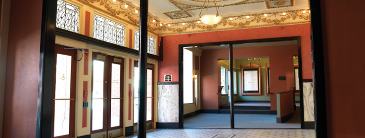
A historic Vermont theater gets a fresh new look in vibrant Arts & Crafts hues.
Artistic inspiration
When it opened on Jan. 16, 1914, the Paramount Theatre in Rutland, Vt., was a crown jewel of the town, and quickly attracted top-shelf talent, including Greta Garbo, Joan Crawford and the Great Houdini.
Trains carrying performers on their way to Montréal from New York City would stop in the bustling city to perform, drawing crowds from all over Rutland County and beyond.
But when the passenger trains stopped coming, so did the big performers. Once an entertainment destination in its own right, Rutland settled into its new role as a blue-collar bedroom community for General Electric and other manufacturers. The Paramount Theatre was transformed into a movie house, fell into disrepair, and finally closed its doors in 1981.
Thankfully, that wasn't the end of the story. In the mid-1980s, a sentimental entrepreneur bought the building and put a new roof on it to keep it intact for the time being. Years later, community leaders banded together to rehab the place. With the help of native son, former U.S. Sen. Jim Jeffords, they landed a $1 million federal grant to restore the theater to its original glory under the guidance of historical architect John Berryhill. Once again, Rutland had a performing-arts center for the community and surrounding towns.
In 1997 and 1998, the theater board brought in preservation experts from the University of Vermont to determine the theater's original paint colors. New seats were purchased. A fleet of artisans arrived to repair the theater's extravagant plaster relief work of rosettes and angels. Even the acclaimed F. Schumacher wall-covering company in New York City got in on the project, re-creating the luscious "Du Berry" rose-patterned fabric that had originally adorned the theater's walls.
The restored theater opened in March 2000 to communitywide acclaim. But local painting contractor Paul Gallo, owner of Magic Brush Painting in Rutland, was a little bothered by the lobby. All the grant money had been spent restoring the theater's performing space, so the lobby, box office and intermission rooms were left as they were – walls painted a sad mishmash of sickly leftover yellow paint that obscured the extravagant plasterwork and leaded-glass panels of lacy concentric circles.
How to research and choose historic colors
In 2008 Gallo recruited Malgosia Urbanowicz, a designer and principal at Commercial Arts in Burlington, Vt., to create a color palette that would do for the front of the theater what the earlier renovation had done for the performing space. She accepted the project pro bono, and set to work, poring over her own collection of art books, including William Morris Textiles by Linda Parry, and tomes on the great Arts & Crafts textile designer and watercolorist Charles Rennie Mackintosh.
Taking a cue from the period's penchant for strong colors, Urbanowicz prescribed a bold magenta for the main lobby walls, custom-mixed in Sherwin-Williams Duration Home® low-VOC (volatile organic compounds), washable paint, applied in multiple coats. With Gallo's aid, Urbanowicz added a chair rail to create some visual breakpoints to the room, and painted all the trim in Black Emerald (SW 2936), using SuperPaint® semi-gloss.
For two adjoining rooms, Urbanowicz started with Sherwin-Williams Red Cent (SW 6341) to custom-mix a powerful terra cotta. The ticket office started with Artichoke (SW 6179), and Urbanowicz added in swirl after swirl of dark gold paint, creating an olive-y gold hue that sings in harmony with the gold-leaf plasterwork overhead.
Theater patrons love it. "People recognized that this palette was specifically chosen for this space, and really would never work in a place that wasn't so elaborate and historical," says Gallo.
And there's been a side effect that even Gallo didn't expect: an uptick in liquor sales during intermission. "This area now offers a very warm and exciting transition into the performance venue while bringing patrons back in time," he says.
Dig in. Professional color researchers use a high-powered microscope, called a colorimeter, to examine paint stratigraphies (layers of paint, built up over time). You can do similar work on your own historic space. Carefully excavate a section of the wall, and examine it with a pocket microscope. You won't get quite as accurate a result, but you should be able to see the different layers and compare them to paint swatches.
Soak up the period. If you're trying to tap into history for your inspiration, skip the historical societies, advises Malgosia Urbanowicz. "Black-and-white photography is not going to help you with this mission," she says. Instead, take trips to museums to view period fabrics and costumes; consider purchasing time-appropriate art books from art-book publishers such as Phaidon.
Take advantage of expert resources. Rely on color stories developed by quality paint manufacturers. Sherwin-Williams offers historic palettes representing nearly every architectural style, from Colonial to Suburban Modern. Go to sherwin-williams.com.


