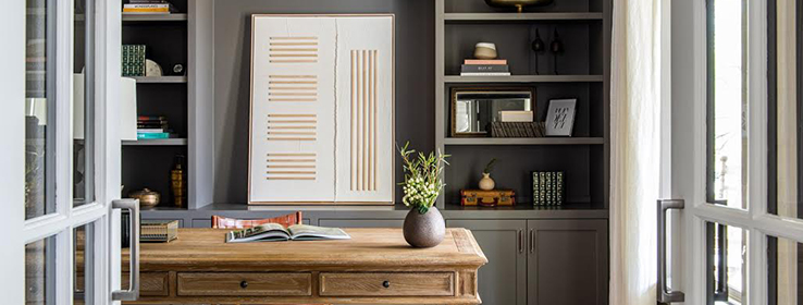
See how fellow designers are using trends like maximalism, grandmillennial character and joyful colors to elevate home offices.
In the past year, home workspaces took on new meaning as people found themselves working remotely for months on end. Whether the space transitions between multiple functions or is used solely for a typical workday, creating an office that offers separation, promotes creativity and fits a home’s interior style is often a must. For this Dallas home, designer Alexis Pearl was tasked with upgrading the builder-grade finishes for a more personalized feel throughout. In the office (above), she added built-in cabinets, custom lighting and vintage-inspired pieces in light wood tones. Painting the walls, trim and built-ins Gauntlet Gray SW 7019 (244-C6) accentuates the space’s contemporary feel. “This is the first room you see when you enter the house, and we wanted it to make a statement,” Pearl says. “Because of the great natural light, we were able to choose a moody gray without the overall space feeling too dark.”
Bold color choices make the following four spaces inspiring places to work, too.
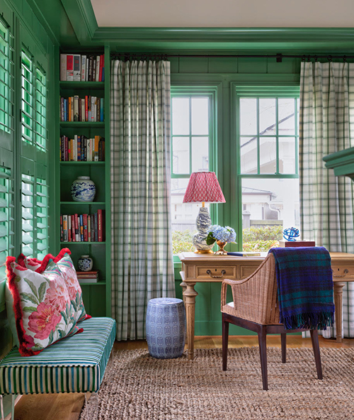
Historic Roots
Patterns, textures and bold color choices are pillars of grandmillennial design, a style inspired by the traditional maximalist interiors of the 1920s and ’30s. Designer Jonathan Parkey incorporated aspects of the trend into the design of this home office as an homage to its location in the historic Heights neighborhood of Little Rock, Arkansas. “We wanted to design the office in a way that felt fitting for a young family while honoring the history of the home and surrounding neighborhood,” he says. “The color palette was key in creating a fun-filled and joyful space.” Inland SW 6452 (158-C5) on paneled walls, trim and built-ins saturates the room with vintage character. Mixing elements of blue and red in plaids, stripes and floral patterns completes the historic charm.
Photo by Rett Peek, At Home in Arkansas Magazine
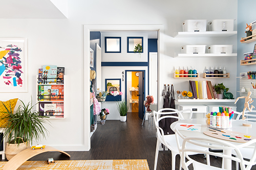
Room for Play
Before being transformed into every kid’s dream play space, this basement in Potomac, Maryland, was underutilized and adult-oriented. The grOH! Playrooms team worked closely with the homeowners to redesign the space into one the entire family would enjoy and use. “We selected a light and airy Sherwin-Williams palette that encourages playfulness and creativity while also maintaining the sophistication of the rest of the home,” says Jodi Arellano, grOH! co-founder. “The colors and decor were intentionally selected to stand the test of time and strike an aesthetically pleasing balance. We wanted to acknowledge the children who play in the space but complement the style of the grown-ups.” Honest Blue SW 6520 (185-C2) and Extra White SW 7006 (257-C1) provide a soothing backdrop in the main room, which includes a craft area, reading nook, theater space and rock-climbing wall. In the custom two-level playhouse, Salty Dog SW 9177 (253-C2) and pops of Goldenrod SW 6677 (133-C6) inspire imaginative play. Now, the basement functions as an area that invites play for kids and kids at heart alike.
Photo by Laura Metzler Photography
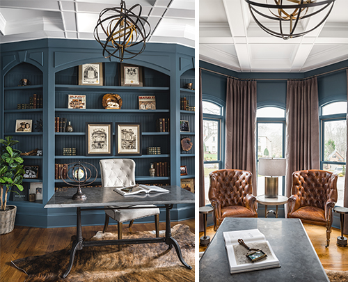
Transitional Vintage
Creating a space that is transitional, timeless and personal was designer Sara Brennan’s goal for this home office in Waxhaw, North Carolina. “We wanted to use a fun, bold color, but we also needed it to work with the neutral color palette for the rest of the space,” Brennan says. “I did a lot of research and found the perfect blue in a shade that felt professional, moody and interesting all at the same time.” Waterloo SW 9141 (221-C6) was the color that fit the bill, emphasized by a white ceiling and brass and brown leather details. Mixing new pieces with family photos and diplomas on the built-in shelves makes the room feel personal and collected over time. And once the workday is over, the sophisticated finishes and bold wall color transform the room into a whiskey lounge by night.
Photos by Tiffany Ringwald Photography
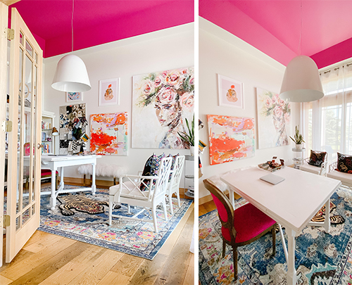
Pop of Pink
At her home in Michigan, interior designer Allison Roundtree’s personal home office toes the line between modern maximalist and minimalist styles. Complete with a ceiling painted Exuberant Pink SW 6840 (101-C1) and walls with the simple Alabaster SW 7008 (255-C2), the space serves as both a place to find inspiration and a reminder to think outside the box. “With the ceiling’s angles and 12-foot height, I knew it was the perfect opportunity to go for a bold fifth wall and in a color that would express that this is a woman’s office," she says. “Then, for the walls, I chose Alabaster to keep the space feeling clean and bright.” Layered rugs and artwork echo the playful color palette, while sheer curtains filter the light from the wall of windows, adding to the airy, feminine vibe.
Photos by Allison Roundtree
For more home office design inspiration, follow Sherwin-Williams Design Pros on Instagram..
Photo at top by Robert Tsai Photography


