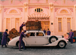
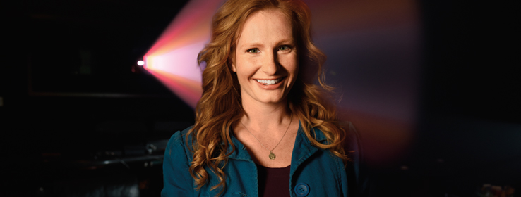
The Grand Budapest Hotel won three Oscars for visual excellence. Jill Bogdanowicz made sure color expressed itself fully in every frame.
By Susan Dietrich
Jill Bogdanowicz loves color. “It’s always been my passion, even when I was a little kid,” she says. She grew up watching her father, Mitch Bogdanowicz, earn two Oscars for film science and technology. “I learned early that knowing the science behind art is the only way to truly master it,” she says. After graduating college as an art major with a physics minor, she interned with color engineers at Kodak. All this preparation was for a career — digital intermediate colorist — that didn’t exist … yet.
STIR: When did you get your big Hollywood break?
Jill Bogdanowicz (JB): Kodak sent me to assist the film colorist on the Coen brothers’ O Brother, Where Art Thou? Back then, in 1999, they were using cutting-edge technology and there was a lot of pain going from film to digital. I even got to work with the cinematographer Roger Deakins when the colorist got sick. It was the first feature to use the digital intermediate technology. That’s where it all started.
STIR: Explain what a digital intermediate colorist does.
JB: It's like Photoshop, only for movies. Each frame has a digital file, so we go in and adjust the color of each frame. We can pop the colors, stylize or tweak them in many ways. The idea is to highlight the layers of detail, to move your attention and interpret the palette to tell the story.
STIR: How is working with color in film different than doing so in interiors?
JB: I don’t think there’s much of a difference. It’s all about making a palette work and personal interpretation. The techniques are very similar. A lot of the time what I do is use opposite colors to add depth and definition.
STIR: In director Wes Anderson’s The Grand Budapest Hotel, everyone is chasing one another in a wildly colorful and convoluted caper that flashes back and forth between decades. How did you use color to communicate shifts in time and narrative?
JB: Right away, in the opening scene, Wes takes you into his story. A girl walks into the Old Lutz Cemetery awash in colors inspired by old photochroms he found of grainy, hand-tinted travel images from the early 1900s. The situation is contemporary, but the style is not. You know something is different, though: You are in Wes’s world.

STIR: How does our perception of a certain historical era’s palette square with the reality of those colors?
JB: In the movie, Wes envisioned the look of his 1930s Grand Budapest Hotel scenes to be stereotypically de-saturated or faded. But we tried that and it did not work. If you transported yourself into the 1930s, it wouldn’t be faded! So I said, ‘Let’s go with what we’ve got. Let’s celebrate the color.’ We popped the pinks, the purple suits and red rug. A red room makes you feel more energy, right? In those saturated colors, the rich personality of Wes’s characters and the incredible production design and all the layers of detail came together. Color tells the story. If it takes you out of the story, I haven’t done my job.
STIR: Like a Grand Budapest Hotel lobby boy: “completely invisible yet always in sight,” as demanded by concierge Ralph Fiennes’s M. Gustave.
JB: Exactly, yes!
This article originally ran in the 2015 STIR Print Annual issue.


