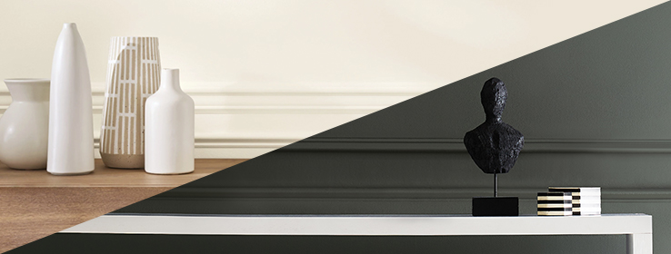
We have been exploring what it means to seek comfort in our surroundings through the use of color. Color can have a powerful influence on a sense of well-being, but which hues and shades speak to us of peace and calm?
That question has multiple answers, and here we explore why soft lights and cocooning darks seem to be resonating right now.
Color Trends in Balance: Yin & Yang
We’ve noticed a distinct shift in interior styles to those that nourish, uplift, and provide a sense of grounding connection to nature. In color trends, we’ve seen a surprising duality emerge.
Soft and tranquil tones bring a muted sophistication, with calming barely-there pastels coming to the forefront and being elevated with luxe touches, antique ornaments, gleaming crystal and a mix of metallic accents. Meanwhile, dark and moody pigments ease the mind with a cozy, insulating effect.
In both cases, these colors have moved beyond contrast or accent color status and are transitioning into beautiful all-over applications. The results are inventive, compelling, and always a little unexpected.
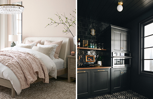
The diverse colors of calm are shown here in Pottery Barn’s use of Kestrel White SW 7516 (266-C5) at left and our March 2022 Color of the Month, Iron Ore SW 7069 (251-C7), employed in the striking kitchen at right by Jean Stoffer Design (photo by Stoffer Photography Interiors).
The Design Styles of Comfort
Whether your next project calls for a soft and hazy cotton-candy color or a vivid and striking statement dark, either selection can lead straight down the path toward some of this moment’s most-loved design styles: warm minimalism and dark maximalism.
We’re seeing a tendency toward expansion, lightness, and airiness in design. Pretty pastel-leaning tints grow ever more popular, but these delicate tones aren’t always styled as sweetly as might be expected. Instead, the new pastels are growing (and glowing) up, with calming and warm heathered tones making themselves right at home among surprising style influences, industrial details, and eclectic glamour.
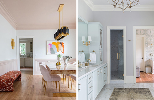
Bari J Ackerman’s two-toned dining room uses Extra White SW 7006 (257-C1) cozied between wainscoting and ceiling of Malted Milk SW 6057 (195-C1). A blissful bathroom by Cheryl Luckett of Dwell by Cheryl features walls of Gossamer Veil SW 9165 (238-C1) and cabinets in Sea Salt SW 6204 (217-C1), photo by Erin Comerford (right).
In contrast, deeper shades are taking root in the moody and mysterious dark maximalist aesthetic. Following a long run of stark minimalism and soft sterility, this coveted style is characterized instead by dark hues, deeply saturated jewel tones, and “carefully cluttered” curations of decor and keepsakes that create a cohesive, quirky sense of coziness.
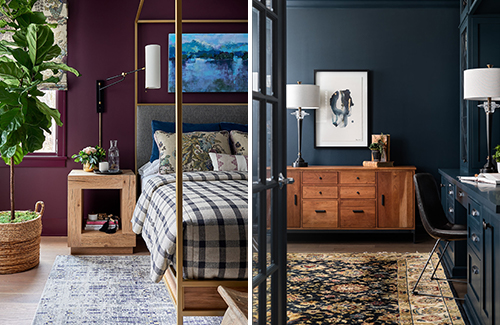
Walls and woodwork in bold Blackberry SW 7577 (109-C7) and deeply mysterious Dark Night SW 6237 (222-C7) speak volumes in Susan Hill’s beautiful bedroom and an awe-inspiring office by Sarah Coe Design. Photos by Dustin Peck (left) and Marina Storm (right).
Our Trending Tints and Dramatic Shades
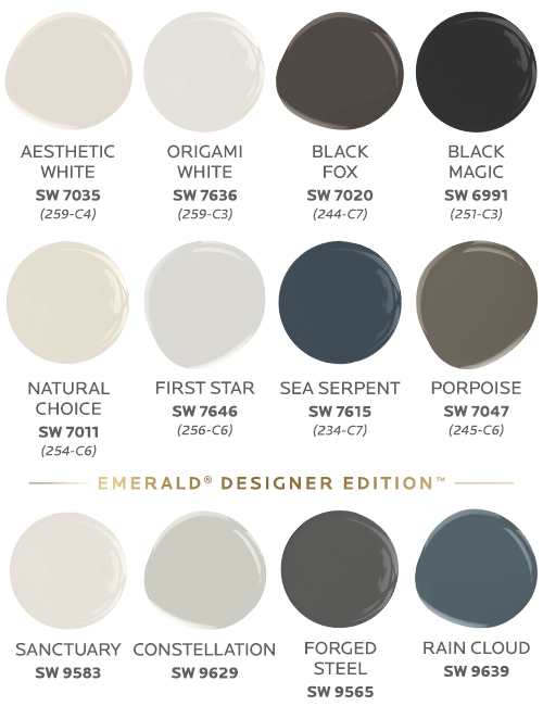
Here are our current most-loved lights and most-desired darks, top-ranked by our designer community.
Colors in top image (left to right): Alabaster SW 7008 (255-C2) and Forged Steel SW 9565 (Emerald Designer Edition)


