By Megan Swoyer
Two Michigan kitchens get mod, ultra-functional makeovers with the help of Sherwin-Williams paint colors.
Modern kitchens give off various vibes. Contemporary cool, farmhouse chic, ultra-progressive, midcentury modern vintage … the list goes on. What they all have in common, though, is a confident design that exudes a sense of ownership.
Definitive design requires relentless attention to detail — from appliances to light fixtures, from cabinetry to countertops. But the most important touch of all? The paint. Picking the right hues for the walls, trim and ceiling can make or break the overall effect of a kitchen.
A tale of two kitchens
Two recently redesigned metro Detroit kitchens illustrate this concept well. Both are modern, but one goes "modern-sleek-and-warm" with clean lines, while the other heads down a country lane of sorts, embodying a style its designer calls "modern farmhouse." As different as the two are, their gray wall colors showcase one of today's hot neutrals.
Choosing the perfect color
When on the hunt for the perfect hue for their brand new kitchen, Judy Bell, along with her husband Brian, used a Sherwin-Williams paint consultant to help choose a wall color. This made the selection process much simpler, though "only after I'd already purchased nine samples and blown through a lot of paint trying different hues," Judy says ruefully.
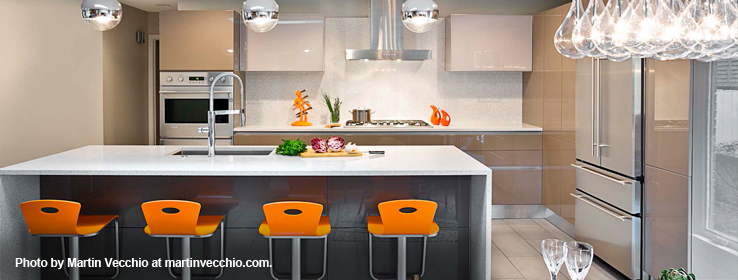
They landed on a gray called Crushed Ice (SW 7647) and paired it with an orange called Carnival (SW 6892). "Despite its name, it's actually perfect, because it doesn't look like a circus," Judy says, with a laugh.
Judy worked closely with Alisha and Niki Serras, sisters and co-owners of Scavolini by Cucina Moda, located in Birmingham, Mich., to transform the gutted space (once a galley kitchen built in 1967) into the clean-lined, sleek and modern oasis it is today. The Bells now adore their new kitchen and bar area.
"We went with gray cabinetry — lacquer and glass so it's not matchy-matchy — for a monochromatic effect with the Crushed Ice, and added lots of bright pops of orange to complement the Carnival," Judy says. "It's funny. While I'm not usually a bright-color person, I tended to gravitate to apple green and orange for some reason."
Between the two choices, orange won out. In fact, the Bells' entryway also received the Carnival touch, which makes for a nice transition into the kitchen and bar area.
Niki observes that many customers prefer choosing bright wall colors for their contemporary kitchens because it's relatively inexpensive to change out if they tire of the color. "If your furniture, cabinetry and flooring are in neutral tones, like the Bells' are, then you can have fun with bright, festive colors like Carnival," Niki says. "Wall colors allow you to express yourself. Whether it's the holidays or everyday life, everyone gravitates to the kitchen area, so you want a color palette that's comfortable, yet speaks to who you are."
As for Amanda Heyse, the lifesaving Sherwin-Williams color consultant Judy met at her local Sherwin-Williams store? She's been pretty busy lately. "I've referred four friends to her since we renovated our kitchen," Judy says with glee.
Tea for two
When interior designer Margaret Presti, owner of Margeaux Interiors, first walked into the kitchen of homeowners David Collins and Christina Anderson, she was greeted with a sage green ceiling. "The color just wasn't working," Presti says. "It gave the space a somber, closed-in feeling."
Because David grew up in England, the couple wanted a space that had a bit of Britain to it, an inviting respite after a long day where they could enjoy a quick "cuppa" (tea).
"The former kitchen was quite dark and old-fashioned," Presti says. "They wanted a traditional yet minimal look for their kitchen that would be functional but also beautiful." She worked with Prestige Design & Build of Birmingham to create a bright, contemporary "farmhouse" kitchen for the Ann Arbor couple.
Presti selected Sherwin-Williams Repose Gray (SW 7015), a light gray hue. The trim and ceiling are in Sherwin-Williams Alabaster White (SW 7008), which Presit says is "a slightly warmer white that tied the ivory cabinetry and appliances — mostly all-white for that modern appeal — together with the gray walls, countertop, backsplash, range hood and pewter hardware. We didn't want one color to overpower the other, but rather to complement it."
The cabinetry color was a major inspiration when it came to selecting the wall color, Presti recalls. "The homeowners wanted a warmer white versus a bright-bright white," she says. "And then we looked at the backsplash with its natural stone, which allowed us to further evolve our color selections. We didn't want the wall color to be too dingy, too bright or too washed out, plus we wanted it to tie in with the rest of the house, which included a lot of ‘builder beiges.'"
Presti also took into account the island's wood countertop and the large farmhouse-style wood table. "I knew the warm wood tones would mix well with ivory and gray hues," Presti says. The addition of two eclectic, caged light fixtures above the kitchen table "nicely combines the couple's regard for tradition with a modern sensibility," she says.


