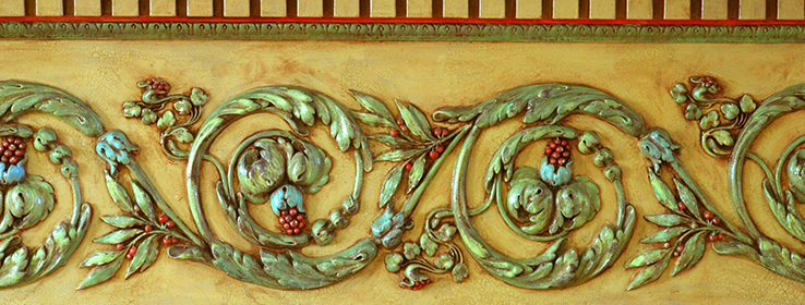
Designers share their favorite ways to put a fresh, modern spin on traditional-style interiors.
By Holly O'Dell
Flash back to the early 2000s. It was a brand-new century, yet Old World–inspired design had a firm hold in stylish American homes, hotel lobbies and restaurants. The look — heavy on embellished detailing, distressed metals, handcrafted wood, damasks, plaster walls and a color palette ranging from antique creams to deep, earthy browns — reflected the mood of consumers following 9/11 and, later into the decade, the Great Recession.
Today, with the economy rebounding, many homeowners are looking to shed weighty design elements and embrace a more contemporary, brighter look that speaks to an optimistic mood. Still others seek a hybrid style that blends the best of both worlds.
Many clients who redesigned residential spaces within the last several years want to refresh elements rather than invest in a complete overhaul, says Rose Dostal, owner of RMD Designs, based in Hudson, Ohio. The easiest refresh is paint, she notes, such as refreshing a dark red wall by adding white crown molding. “It offers high contrast and frames the space,” she says.
Using only one or two paint colors throughout an entire home can help unify Old World and contemporary elements, says Kerry Howard, owner of KMH Interiors in Atlanta.
“Instead of having one color in the dining room and one color in the kitchen, I usually use a warm gray —it’s my go-to color,” says Howard, who favors Sherwin-Williams Anew Gray (SW 7030) and Sherwin-Williams Worldly Gray (SW 7043).
Faux finishing, one of the staples of Old World–inspired design, is also getting a reboot, with lighter, fresher approaches and increased use of faux metallic looks, Dostal says. “You can go from ultra-modern to industrial chic, depending on the technique used and what surrounds it.”
Stenciled faux finishes are yet another way to freshen up an Old World look, Howard says.
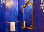
Even for homeowners who still prefer the Old World aesthetic, designers find creative ways to bridge the classic with the contemporary. In the powder room of an older, traditional home, Kansas designer Mitzi Beach, owner of Mitzi Beach Interiors, found a dramatic way to work with her client’s traditional gold fixtures. “We could not just go in and do something fun and flippy on the walls,” she says. She worked with artist Joey Pohl, who applied layers of vibrant cobalt blue paint to create a marbled, almost sculptural effect using the grisaille technique.
Bigger projects
For homeowners with bigger budgets, replacing dark surfaces with lighter, more modern ones makes a big impact. In a kitchen he completed last year, Howard used a gray Virginia Mist granite, in a honed finish, on the island to complement the perimeter countertops, which were creamy white granite with a hint of gold. “It looks like somebody took sand and blew it across the top of the granite,” Howard says. “It had a beautiful movement to it.”
Updating Old World design with contemporary touches can produce surprising yet stunning results. Howard recently visited a remodeled home in Georgia that boasted “beautiful classic architecture with the gorgeous iconic columns,” he says. “When we drove up, I thought, ‘This house is going to be very Old World and traditional.’”
Instead, Howard found the unexpected: pumpkin-orange grasscloth topped with a fleur-de-lis design in the dining room. The vibrant orange color extended to the adjacent study with a tone-on-tone rug that offered a modern complement to the surrounding furniture.
Updating an Old World look requires a balance of finishes, according to Howard. “If you had an Old World kitchen, for example, with dark mahogany or alder-wood cabinets, I would lighten up the space with a white Carrara or Alabama marble in a honed finish for a cleaner look.”
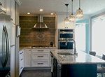
Dostal recently converted an Ohio kitchen by replacing its tired golden-toned cabinetry with bright white perimeter cabinetry and rich espresso cabinetry for the island, which was also updated with a gray slab top. Wood flooring with a weathered look was installed and complemented by amber-hued glass pendants. She also enlarged the windows to bring in more natural light. The highlight of the space is a pewter plaque — crafted by the homeowners’ favorite local artist, Don Drumm — integrated into the gray tile backsplash.
In her own restored 1940s home in Wichita, Kansas, Beach kept her lighter-toned walnut floors but painted her dark woodwork in an ivory hue. In her dining room, an Old English table and chairs mingle with white midcentury modern chairs that complement the adjacent living room’s overstuffed cottage-style sofas upholstered in canvas duck cloth.
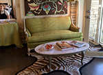
For a recent project, Beach had a client who wanted to integrate her French provincial-style furniture, crafted in the 1950s and ’60s but most recently styled in 1980s powder blue and mauve. Beach refinished the sofa in a chartreuse green fabric with a moiré finish, while artist Pohl finished the wood frame and legs in layers of crisp white. He also created a contemporary painting to hang above the traditional sofa.
“Combining Old World pieces and architecture with contemporary details is a perfect solution in looking toward a brighter future but also having that security of what we have known,” Beach says.
21st-Century Faux
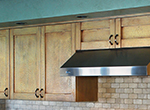
Faux finishes in earthy rustic hues became a hallmark of the Old World Tuscan aesthetic that was so ubiquitous in the early 2000s. But those timeless painting techniques look fresh and new when combined with today’s colors and the latest in paint technology. Sherwin-Williams Faux Impressions® collection of coatings add dramatic depth, shimmer and character to even the most contemporary interiors. Explore Faux Impressions Venetian Plaster, Metallic, Quartz Stone and more.
Images provided by Mitzi Beach Interiors, www.mitzibeach.com; Joey Pohl, artist: Blue bathroom, green settee with zebra area rug.


