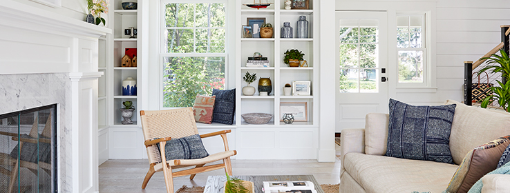
Architect Tyler Zagryn brings a crisp coastal look to a modern farmhouse in part by painting it Alabaster SW 7008 (255-C2) inside and out.
Jamestown, Rhode Island’s special sense of place didn’t simply inspire an element or two for this modern farmhouse. It set the stage for the entire design, right down to the smallest detail. “Jamestown is a little quiet,” says Tyler Zagryn, senior project architect at DiMauro Architects. “There are a lot of farm settings and all of these protected pieces of land. But then you’re only a five- to 10-minute drive over the bridge to Newport.”
The 2,000-square-foot home’s resulting look — a relaxed rural foundation layered with coastal character — creates a feel that’s straightforward with just the right touch of sophistication. “It really feels like it’s in keeping with the neighborhood, and it looks like it’s already been there for 20 years,” Zagryn says.
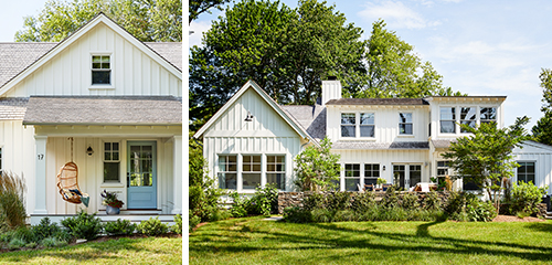
Alabaster SW 7008 (255-C2) keeps the home’s board-and-batten exterior — shown from the front (left) and from the back (right) — clean and simple. “I knew as soon as Alabaster went up that it was the one we were going with,” architect Tyler Zagryn says. The front door is painted Tradewind SW 6218 (219-C1).
The architect attributes the home’s established appearance to carefully planned exterior architectural features, including comfortable scale. “We really make an effort to break down the massing of our houses,” he says. That’s why the front-facing roofline is low-slung, with a large gable at the entry.
A simple, thoughtful palette of materials extends the feeling of timelessness. Alaskan cedar-shake shingles, for example, make up most of the roofing. “Wood roofs are at a premium — we know that,” Zagryn says. “But we really feel it makes the architecture, so it’s one of the things that we always love to incorporate into our designs.”
The natural materials beautifully complement the home’s farmhouse-style board-and-batten composite siding, bracket details and trim, all painted Alabaster SW 7008 (255-C2). “I’ll admit that it is difficult to choose the correct white paint,” Zagryn says. “But I’d say 90 percent of the time we want white, we spec Alabaster. It’s a warmer white color.” Other firm favorites are Snowbound SW 7004 (256-C2), Pure White SW 7005 (255-C1) and White Flour SW 7102 (267-C2).
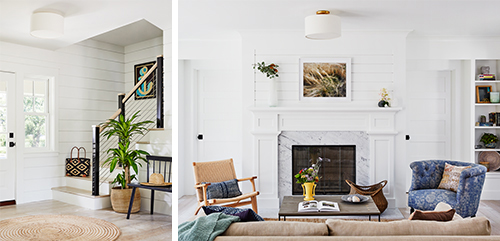
Modern stair railing in the entry hall helps the tight space feel open. But the family room fireplace leans more traditional. “The mantel’s traditional millwork-and-marble design feels warmer than a more modern approach would have,” Zagryn says. Along with the surrounding shiplap paneling, it’s painted Alabaster. “You can imagine that if we painted the boards above the fireplace some type of accent color, it may have looked a little out of place,” Zagryn says. “The Alabaster blends everything together nicely.”
The design team didn’t stop with Alabaster on the exterior. “We loved it so much that we took it to the inside of the house,” Zagryn says. “We’ve found that Alabaster is really versatile. It works with other colors like seafoam green that we sometimes use on the walls. And it’s comfortable to look at.”
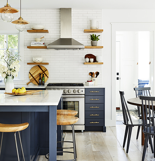
Navy blue Wood-Mode cabinets, white subway tile stretching from the countertops to the ceiling, oak shelves on either side of the range, and walls painted Alabaster create a distinctive modern-farmhouse mix in the kitchen. Duchateau Atelier Series engineered-wood flooring covers the floors here and in most of the home.
In fact, Alabaster coats the walls, woodwork and trim of most of the open family room, kitchen and breakfast area, as well as the mudroom, main-level owner’s suite bedroom and upper-level kids’ bunkroom.
But blue enters the equation twice — in the kitchen and owner’s suite bath. “Those were bold pops of color that the clients knew they really wanted,” Zagryn says. Kitchen designer Rachael Louzon with Heritage Kitchen Design, in collaboration with the architectural team, specified blue Wood-Mode kitchen cabinets that relate to the walls of the owner’s suite bath. The bath’s walls are painted Indigo Batik SW 7602 (224-C7).
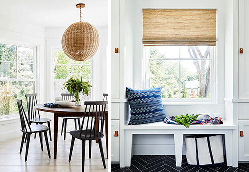
An east-facing orientation ensures the breakfast area (left) is bathed in light early in the day. The mudroom (right) combines plenty of cabinet storage with the charm and practicality of a window seat.
Zagryn notes that using the hue was a bit of a risky move for his team. “You imagine that putting a dark color in a space of this scale is going to make the room feel smaller, and we were nervous about that,” he says. But a pale weathered-wood vanity, antique brass hardware, and marble countertops and floors balance the look. “I’ve got to say, after that room was put together, it really came out nice,” he says. “And it’s something that I think we’ll try doing again in the future.”
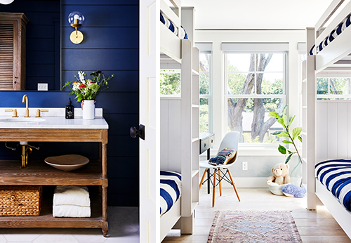
Indigo Batik SW 7602 (224-C7) brings coastal color to the owner’s suite bath (left). A pale weathered-wood vanity, along with marble countertops, balances the look. Beds in the kids’ bunkroom (right) were planned into the room’s design. “They’re almost like little bunks in a ship cabin,” Zagryn says.
Photos by Read McKendree
Want to see more of this house? Follow Sherwin-Williams Design Pros on Instagram.


