By Megan Swoyer
With the help of Sherwin-Williams paint colors, the Michigan chapter of ASID redesigned a women's shelter that won the 2014 National ASID Community Service Project competition.
Interior designer Debra Christy of southeast Michigan's Wake Up Your Space remembers well the day she realized a huge — and hugely meaningful — design project would come to fruition.
Nearly three years ago, she'd started working with the American Society of Interior Designers-Michigan Chapter (ASIDMI) to help redesign a women's shelter called Turning Point.
"This was a very big project and I knew I'd need lots of help," Christy says. "Initially, we were doing just the children's and residents' areas, but the shelter's board was so blown away by our proposal that they asked, ‘Can you do the whole thing?'"
So she started making phone calls. One of the first was to neighbor, interior designer and fellow ASID member Linda Shears. She also enlisted Dwane Adle, ASID; Tina Rossi, Allied ASID; Kimberly Blum-Parrish, Student ASID; and Eileen Minna, ASID. Members of the Interior Designers Coalition for Change (IDCFC) also signed on, including Carolyn Dwyer, Cheryle Segal, Sandra Stacey and Sara Olson.
After teaming up with architect Patrick Findlan, Designer Account Executive Rebecca Luckhardt at Sherwin-Williams (an industry partner with ASID), and various trades, Christy began to breathe easier. With this wealth of talent working together, how could they not succeed?
"It was emotional for me to do the walk-through of the original shelter," Christy says. "There was laundry in the kitchen area, the children's area was a wreck, the safety gates were questionable at best. Everything was just, well, …"
The team quickly got to work. Although they had different backgrounds and style bents, they shared a strong sense of mission: to help the community and the residents and families of Turning Point, and make the shelter a peaceful, nonthreatening and welcoming place.
Naturally, one of the first things they thought about was color. In fact, their color selections helped the project win the 2014 National ASID Community Service Project competition. This award is bestowed annually upon a chapter whose community service best exemplifies the spirit of bringing design to life in the service of others.
Each of the members "sort of fell into their space of responsibility," says Shears, who designed the children's activity space with Adle. Dwyer oversaw the creation of comfortable offices and administrative areas, Rossi pulled together 13 relaxing resident bedrooms, and Blum-Parrish whipped up an inviting family-style cooking and eating space.
"Everything flowed according to our color selections," Christy says. They chose most decorative elements and wall paint based on Turning Point's logo colors: green and purple. "Both of those colors are healing and peaceful," Dwyer says.

"We had to be careful with our selections. For example, art had to be serene and not scary — with no suggestion of violence, especially from men," Christy says. "As designers, you don't learn that in school. We had to be sure the colors were healing and inviting, as women are coming here from very traumatic situations and might stay as long as 90 days."

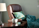
The reflecting lounge — with a rocking chair, writing desk, comfortable throws and pillows, and more — invites the women residents to sit and "chill out." It's a safe space for residents to reflect on their futures. Here, the designers chose the terra-cotta-like Travertine (SW 7722) for the wall paint. "t's a warm, cheerful color, and the purple accent — from the furnishings and accessories — is a soft, light lavender," Christy says.
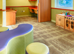
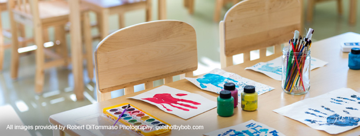
The kids' space is awash in Rice Paddy (SW 6414), which blends nicely with a chair rail stained in Bright Cherry (SW 3109) and fun wallpaper.

Rice Paddy was also used in the kitchen and laundry room. Blum-Parrish recalls the cabinets in the kitchen were supposed to be white, but she felt they were "too stark and not homey enough." As this space was about coming together — mothers and children cooking and eating together — Blum-Parrish went with warm wood cabinetry and a lighter green porcelain floor — both a perfect complement to Rice Paddy.
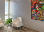
Frosty White (SW 6196) adorns the lobby and offices. Its distinct gray undertone takes on a silvery appearance, which nicely sets off the spaces' violet accents.
In each of the resident rooms, Rossi painted three of the walls in Travertine, but the fourth wall in each room boasts a unique color. "Amid all the bunk beds, night stands and wardrobes, Travertine and the accent walls make it feel like a home — familiar yet special," Rossi says.
Other Sherwin-Williams colors used include Hot Cocoa (SW 6047) for the stairs, Pure White (SW 7005) for ceilings and soffits, and Modest White (SW 6084) for the bathrooms.
"Interior design can transform people's lives," Christy says. "The new Turning Point facility is user-friendly, safe, clean and peaceful. I believe our design choices help provide these residents with renewed dignity."


