Tips on using the Colormix® Forecast 2020 palettes in the commercial market
Keeping tabs on trends is crucial for commercial designers, and it never hurts to tap experts such as Emily Kantz, healthcare and hospitality color specialist for Sherwin-Williams. We reached out to Kantz for her thoughts on the latest in design and color for the commercial market.
Q: What are some trends you’ve been seeing in commercial design?
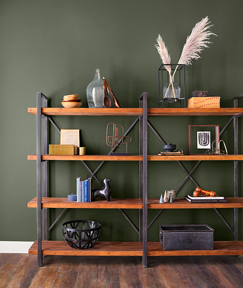
A: One strong trend is biophilic design — bringing the outdoors inside through the use of plants and living walls. We’re seeing a lot of rich greens and blues, creating very inviting, alive spaces.
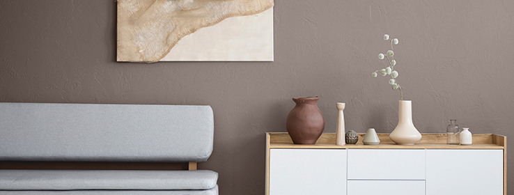
The Modern Primitive trend continues to be relevant, too. It’s a style that includes chunky shapes, rough finishes and traditional artisan-made artwork and furniture. The colors are very earthen — browns and whites play a strong role.
Localization is another exciting direction in commercial design right now. It’s about paying tribute to a local culture — designing a hotel that reflects the history and surroundings of where it’s placed, for instance.

Q: What influences do you see driving these trends?
A: Simplification has a large appeal to people these days. In the commercial space, that’s expressed in the clean lines of Scandinavian design and in Japanese-style functionality and serenity. It’s the Marie Kondo mindset of keeping only what’s essential or what sparks joy. This applies to people at home and it certainly applies to where they work, play and heal.
Another influence points to sustainability — and reviving existing buildings rather than starting over. This is about adaptive re-use, but it’s also an opportunity to embrace the eccentricities of a period. For example, I just saw a turn-of-the-century meat market turned into a beautiful office space. The renovation kept the big, original windows and many of the architectural features, then everything was painted white to create a clean, modern space.
Q: How can commercial designers stay on top of color trends?
A: We’ve just released our Sherwin-Williams 2020 Colormix Forecast palettes, so that’s a great place to start! This year, our team focused on the ideas of balance and simplicity, so the palettes have an overall wellness theme. Anyone in the commercial market — designers, architects and those who manage people in workplaces — is concerned about wellness, so it’s a very timely collection. The colors work great in a healthcare setting, of course, but wellness resonates well in the hospitality and education sectors, too.
Q: Each palette in Colormix represents a slightly different perspective on the wellness theme. Can you share some insights about how each palette relates to the commercial market?
A: The Alive palette is very earth-based. Its rich blues and greens naturally tie in with the biophilic trend I spoke of earlier. Mantra is filled with very soft, neutral colors that work well in a variety of environments and create a serene, calm atmosphere. Play is a fun, uplifting palette for any age, any gender, any facility; it doesn’t take itself too seriously and lends a healthy dose of escapism. Haven contains very homey colors that can help designers reimagine commercial spaces as extensions of home. And finally, Heart is a purposeful, intuitive palette that blends modern sensibilities with a resurgence of classism or Art Deco.
ALIVE
“This bold collection of colors can be used in small doses for maximum effect. Great for use in hotels, workspace lobbies, public areas and restaurants.”

- Naval SW 6244 (253-C6)
- Tassel SW 6369 (128-C5)
- Ripe Olive SW 6209 (217-C7)
- Sleepy Blue SW 6225 (220-C1)
- Endless Sea SW 9150 (223-C7)
- Cavern Clay SW 7701 (290-C6)
- Touch of Sand SW 9085 (199-C1)
- Sandbank SW 6052 (194-C3)
- Canyon Clay SW 6054 (194-C6)
MANTRA
“These colors can be used in a variety of environments. It’s a subdued, chalky pastel palette, so it works well in healthcare, hotels and workspace design.

- Grayish SW 6001 (240-C1)
- Breathless SW 6022 (191-C1)
- Mystical Shade SW 6276 (226-C3)
- Software SW 7074 (235-C5)
- Misty SW 6232 (222-C1)
- Poised Taupe SW 6039 (232-C5)
- Glamour SW 6031 (192-C3)
- Individual White SW 6008 (231-C1)
- Spatial White SW 6259 (273-C6)
PLAY
“These fun, bold and daring colors add a definite ‘wow’ factor to a space. Use the palette in hotels to make an Instagrammable moment, or in a workplace or school as a visual pick-me-up.”

- Juneberry SW 6573 (103-C6)
- Pure White SW 7005 (255-C1)
- Eros Pink SW 6860 (105-C5)
- Gambol Gold SW 6690 (136-C5)
- Oceanside SW 6496 (172-C7)
- Rock Candy SW 6231 (257-C6)
- Auric SW 6692 (136-C7)
- Aquarium SW 6767 (164-C5)
- Caviar SW 6990 (251-C2)
HAVEN
“This palette is great to use just about anywhere — a doctor's office, a calming respite in a work area or even in a hotel spa.”

- Acacia Haze SW 9132 (217-C4)
- Beige Intenso SW 9096 (202-C3)
- Pewter Green SW 6208 (217-C6)
- Perle Noir SW 9154 (226-C7)
- Eider White SW 7014 (256-C5)
- Stardew SW 9138 (221-C3)
- Kingdom Gold SW 6698 (137-C5)
- Granite Peak SW 6250 (225-C6)
- Functional Gray SW 7024 (241-C3)
HEART
“The lighter tones in this palette are great ‘go anywhere’ colors for a variety of environments. The darker tones work well on accent features in a guest room, a backdrop at a coffee shop or even as bold accent wall color in a lobby area.”

- Angora SW 6036 (232-C1)
- Likeable Sand SW 6058 (195-C2)
- Redend Point SW 9081 (195-C4)
- Original White SW 7077 (274-C6)
- Cocoa Whip SW 9084 (198-C4)
- Dark Clove SW 9183 (277-C4)
- Coral Clay SW 9005 (114-C4)
- Diverse Beige SW 6079 (198-C2)
- Verde Marrón SW 9124 (209-C6)


