Increasingly popular coworking spaces foster productivity and collaboration for businesses and entrepreneurs. STIR® got the scoop from designers on what makes these spaces special and how to apply color strategies from them to any project.
By Megan Swoyer
From Fueled Collective to Worklab and WeWork to LiquidSpace — and in corporate offices and hotels — colorful, open-style coworking spaces are redefining how designers approach their commercial projects.
Not only are these types of modern work environments aesthetically pleasing, they’ve been found to have benefits for company productivity and culture. Employees say these spaces help increase collaboration and social communication, while entrepreneurs and contract workers who frequent public coworking spaces say they help provide a sense of belonging and socialization.
But to create truly effective open office workspaces, specific design elements — including color strategies — need to be carefully considered and crafted. STIR spoke with commercial office designers to get their take on what needs to be included in a successful coworking or open office space.
Balance for Employees and Work Styles
When Mary Meier Dakin of commercial firm Dakin Design Inc. designs open office spaces for banks and automotive companies, she focuses on creating an atmosphere that inspires three things in employees: collaboration, productivity and happiness.
“When I worked on a project for Toyota, one of their key goals was to retain employees, so we needed to design inviting and productive work areas,” Dakin says. “The workforce is competitive, and spaces are created to attract and retain 20- and 30-somethings.”
Although the younger office-bound workforce is drawn to a more collaborative environment, the spaces should appeal to people who need a more private space to get work done and those who flourish working around others — a good balance of cozy but productive. “You still have to make sure there’s enough space so that people can brainstorm in a quiet environment,” Dakin says. These shared spaces — sometimes referred to as “getaway spaces” — offer the solitude of a cube, but people tend to use them temporarily, rather than holing themselves up all day as they may in their own cube.
Architect Kevin Hart concurs on the need for private areas. Hart, who once specified several thousand square feet of Herman Miller Action Office systems when he was working with Texas Instruments in Dallas and Colorado Springs, Colorado, says, “There has to be a refuge place. I think it works when a small group of employees has an area with a closed door so that they can hold private conversations.” These spaces should be vacant regularly, with no need to “book” the space. If they’re not available, employees are more likely to go outside instead, reducing productivity.
Design for Substance and Style
As for specific design elements, opt for comfort and energy. “In the spaces I design, I love to incorporate overstuffed chairs and pillows, with lots of wood floors or luxury wood vinyls and cool mid-century light fixtures or pendants,” Dakin says. Natural wood tones for moldings and trim are also great to bring warmth into a space, but be sure to pair with color that boosts moods and motivates employees. “Keep wall color or accent pieces bright and fun, with hues in orange, turquoise or lime.”
In addition to stylish details, be aware of the acoustics of an open floor plan. Wide-open spaces can become noisy, so Dakin suggests adding acoustic ceiling tiles, panels and baffles or other materials to help control sound in buildings and prevent echo. These elements can still be decorative, too. “You can add color, texture or even custom patterns to those ceilings,” Dakin says.
And always make the most of windows. More modern working spaces are foregoing treating windows as demarcations between job title and are instead using them as a design element that benefits all employees’ work mood and habits.
Coatings and Color to Boost Collaboration
As for coatings, architect Brad Angelini of Angelini & Associates Architects says it’s important to consider higher-quality coatings. “Higher-quality coatings provide more depth and are more responsive to light than more basic selections.”
Sherwin-Williams Harmony® Interior Acrylic Latex can help achieve just that. Its enhanced, zero VOC formula features Formaldehyde Reducing Technology to promote better indoor air quality while also delivering great hide and a durable finish that withstands frequent washings — perfect for a high-traffic office space.
For color, Dakin likes to incorporate warm, neutral walls, so she often opts for Sherwin-Williams Natural Linen SW 9109 with a light, neutral trim, like Downy SW 7002. “Then I’d create a pop of color in upholsteries and have an accent wall color, like Quixotic Plum SW 6265. For cooler and brighter fun palettes, I like accents in Intense Teal SW 6943, with walls in Tinsmith SW 7657 and contrasting trim in Pure White SW 7005.”

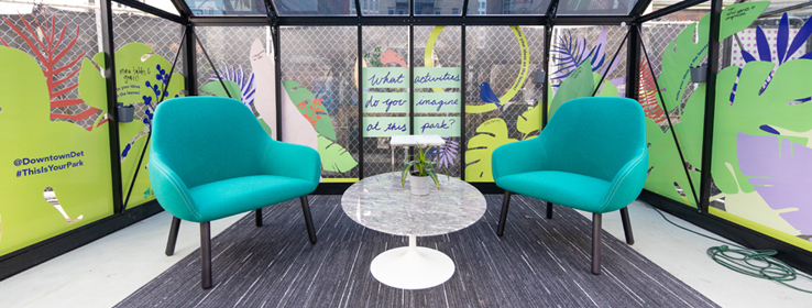
That’s undoubtedly the philosophy at the new pop-up, collaborative public workspaces in the Downtown Detroit Markets. Based in nine glass huts that are used for market space during the winter, these offices pop with chic, clean-lined style and lots of color. “This installation is intended for people to get out of their normal working habits, try something new and think differently about their workspace,” says Sam West of Bedrock Detroit, a commercial real estate firm focused on urban cores.
The pop-ups are led by Detroit design company dPOP and are made possible with help from Bedrock, which also leases coworking space to WeWork, Quicken Loans Community Fund and the Downtown Detroit Partnership.
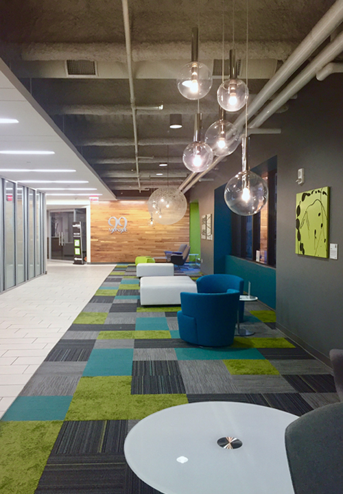
Color also abounds at the Worklab by Custer in downtown Grand Rapids, Michigan. The public office space, which offers day passes, bursts with lime, gray and teal flooring and furnishings; wood accent walls; chartreuse-green artwork hanging on charcoal-toned walls; and eclectic lighting. More private workspaces are open and inviting, and even those with partial walls feature glass partitions through which one can see.
These open workspace trends are even making their way into our homes, design experts say. If you work at home and have associates, Dakin says you have to first keep the area professional-looking, and sounds from the home environment should not be heard. Working in an open office environment at home that others in the family use as well? “The open plan should allow easy communication, visibility and work efficiency between all,” Dakin says.
Our Favorite Coworking Colors


