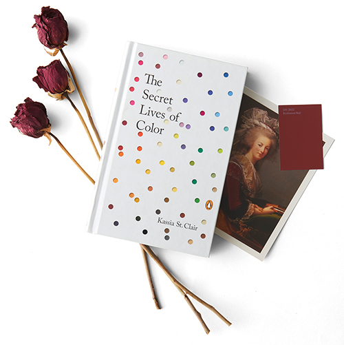
Author Kassia St. Clair dishes on the historical twists and turns that continue to shape our charged relationship to color.
By Shawn Gilliam
What is it about purple that signifies power and royalty? How did white help our ancestors fight the plague — and how does that dramatic history continue to define the ways we design with it? Kassia St. Clair explores the hidden stories of 75 different colors in her captivating The Secret Lives of Color. We caught up with the author and Elle Decoration color columnist in her London office.

How did you become obsessed with color?
I did history at the University of Bristol and went on to do a master’s at Oxford. I was studying masquerade fashion in London during the 18th century, which is a very niche topic, but a fascinating one. I was reading a lot of letters and diaries from the period, which included descriptions of what people were wearing to society parties. A lot of these descriptions featured colors I didn’t recognize. So I started going to look at paintings from that period. If I was lucky, that same someone might have commissioned a portrait of themselves wearing a particular outfit. It fascinated me, the way the names for colors changed over time.
What’s an example of a now-unfashionable color that used to be treasured?
Puce is a good example. Very few people look at puce, and yet it has this fantastic story that links with Marie Antoinette — both at the high point of power for the young, beautiful bride at the center of European fashion, and after the revolution when she’s essentially awaiting death, and she’s allowed a fraction of her once lavish wardrobe. It’s kind of a bittersweet color for her at that time. I wasn’t afraid to include colors people think of as ugly or depressing.
The history of browns is eye-opening, isn’t it?
It surprises everyone — the little section on mummy brown, and the fact that people were making a pigment out of mummified human remains. It’s hard to believe now, and yet you can see it in really famous paintings, like Delacroix’s Liberty Leading the People. It’s used quite extensively in that painting — human remains in a tube.
What is a color with a rich history?
The classic example is ultramarine. In northeastern Afghanistan, chunks of semi-precious stone called lapis were for millennia transported by mule, camel and boat across vast distances. The pigment was stoneground, mixed with other substances and kneaded like dough. People went through an extraordinary amount of effort. It’s beautiful in its own right, and it’s symbolic too. It was part of an artist’s devotion to the Virgin Mary to show how special and important she was to [paint her robe in ultramarine]. Also, there’s a status aspect to it: Patrons commissioning artists specified an amount of surface to be ultramarine.
“Colors rebrand, and a classic example at the moment is pink. For a very long time, pink was looked down on with its troubled relationship to women and feminism. All of a sudden, it’s everywhere.”
— Kassia St. Clair
What about a color with a surprising history in architecture?
One that springs to mind is whitewash. In the 19th century, whitewashing came with this idea of cleansing. During the plague outbreak in Hong Kong, for example, whitewash was painted by the military to halt the disease, and there was a feeling that whitewash had this moral overtone. It signified a person of good moral character in a way that’s really interesting, I think.
What’s a color story that didn’t make it into the book?
Colors rebrand, and a classic example at the moment is pink. For a very long time, pink was looked down on with its troubled relationship to women and feminism. All of a sudden, it’s everywhere, in the guise of millennial pink, and the complete phenomenon of Instagram, and book covers, and huge commercial success.
What was the biggest challenge in creating your book?
Part of the magic of color — what drew me to it in the first place — is it’s so ephemeral and tricky to pin down. Color names are constantly shifting over each other like tectonic plates, and sometimes names take on different colors, and colors take on different names. One of the messages of the book is that there isn’t a perfect ultramarine. Yet in illustrating the book, we had to choose a perfect color stripe going down the outside of the page!


