A smart color palette was key to turning this century-old Minneapolis warehouse into a neighborhood-friendly boutique hotel.
By Kitty Shea
Hospitality design has always been about conjuring a sense of place. That’s even truer today, as cities everywhere are being reshaped by an eat local, shop local movement. For hospitality designers and their clients, “local color” has become a strategy unto itself. Even the big chains are moving some of their portfolios away from the repeatable familiarity of “you could be anywhere,” replacing it with unique, localized properties and experiences.
It’s precisely what led Fe Equus Development in Minneapolis to partner with Aparium Hotel Group of Chicago to convert a 19th-century Minneapolis farm implement warehouse into a trendy boutique hotel. The Hewing Hotel drops a proud, but not too loud, Nordic anchor in downtown Minneapolis’ hip, historic North Loop.
The hotel joins neighbors The Bachelor Farmer (kitchen of last year’s James Beard Award for Best Chef: Midwest) and GQ-favorite men’s clothing store Askov Finlayson in bringing a Scandinavian-modern vibe to that part of the city. Appropriate, as Minnesota leads the nation in concentration of Scandinavian Americans.
“The first thing I do when I find a building is go to the local historical society and start reading,” says Fe Equus owner Tim Dixon.
Dixon, a onetime carpenter, read up on Minneapolis’ rich history as a lumber market. The city was once home to two of the United States’ four largest mills. “Hewing,” the word for the process by which mills cut logs into lumber, landed Dixon a hotel name, logo and font. Hotel guests even get carpenter pencils on their nightstands.
It’s all about the wood
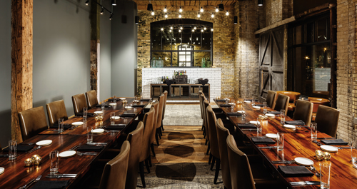
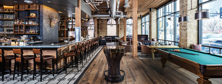
Guests entering the Hewing Hotel emerge from a steel and glass vestibule into a massive timber lobby. The lobby’s architectural heft opens welcomingly into Tullibee, the hotel’s bar and restaurant, as well as the guest rooms and event spaces beyond.
Visitors are immediately struck by the beauty of the old-growth posts and beams harvested from Minnesota’s own pine forests, raw steel connectors, walls of Cream City brick, and light from the 13-foot-10-inch-tall windows. The structure, with its National Register of Historic Places preservation restrictions, clearly demanded design restraint.

“A lot of hotels right now are using restraint on purpose. They want an old, classically inspired look: a neutral canvas they can build off of over time,” says project design lead Ann Fritz, director of interiors at Elness Swenson Graham Architects (ESG) of Minneapolis. “The Hewing had so many historic elements — wood beams, wood ceilings, wood floors — we couldn’t touch, and so much warmth in them and in the brick’s gold tone, that our job was balancing them with clean neutrals — lots of warm white on the walls — and cooler shades.”
The key takeaway in ESG’s proposal — “We want to help you articulate your story” — won over Dixon and won ESG the work. Says Dixon, “Building an experiential hotel is like writing a novel: It has a beginning, the buildup of characters, a climax and a summary. Guests walk into Hewing and visually start feeling the story. All the other hotels out there are really just nice and pretty; they don’t have that story within them.”
Dixon’s direction to ESG was clear: “I can give you the lines; I need you to fill them in with color.”
Coloring inside the lines
ESG’s color specs defer to the storied timber frame while echoing its steel. Public space accents go warmly gray: Roycroft Pewter SW 2848, Passive SW 7064 (236-C1) and Iron Ore SW 7069 (251-C7) lend an industrial tinge to what could risk skewing too roughly “lodge.”
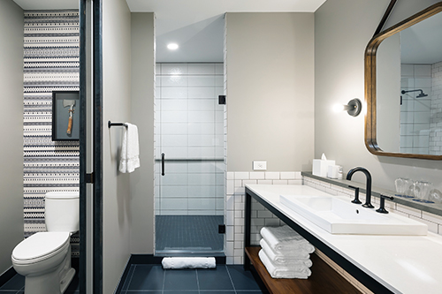
The 124 guest room doors similarly refrain from any kitschy lumberjack reflex. Set along Pussywillow SW 7642 (283-C4) corridors, the evergreen, four-panel doors could be construed as pine-inspired, but in Rookwood Shutter Green SW 2809, they feel more like pine trees on a moonless night. The team was looking for a green that felt timeless, a touch cabin-y, but not mimicking forest: more of a historic exterior color representing a guest’s “front” door. Inside the rooms, Westchester Gray SW 2849 reflects back to the lobby’s topography.

Excitement finds expression in furniture, art and other small furnishings, says Fritz, flagging deep navy, rusty red and gold as “Minnesota primaries” that really pop. Between the lobby, restaurant and bar standalones and built-ins, leather upholstery introduces butterscotch, olive green, black, cognac, gray-brown and chocolate brown: patinas intentionally worn for a comforting look.
Raindrop-shaped bulbs in purple and silver-mirror finishes float down six floors through the lobby atrium, striking stand-out notes. The purple is a nod to the pop star Prince. When Foci – Minnesota Center for Glass Arts was in the middle of creating the glass installation, Prince died at Paisley Park, his nearby recording studio and home.
The reference to “Purple Rain” is understated. How perfect that the Hewing Hotel’s color story is all about deference: about knowing how to fit into the woodwork.
Watch this video to hear more from designer Ann Fritz inside the Hewing Hotel.
Colors
CeilingsGuest room walls
Guest room accent and corridor
Guest room doors
Restaurant ceilings


