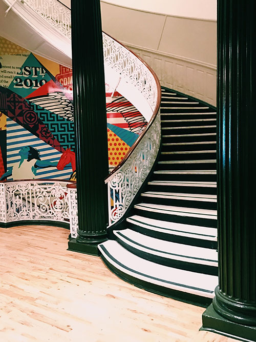
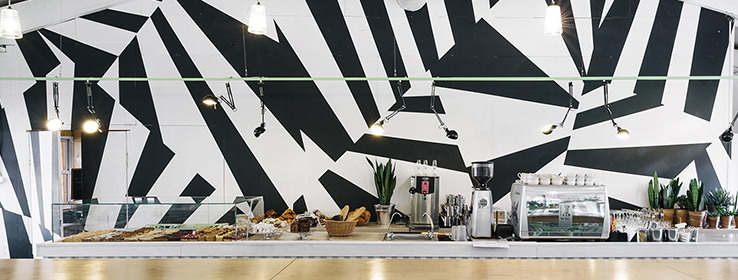
What was once the mainstay of paint design on World War I warships has transformed into an interior design trend that can add a punch of bold, modern elements to your next client project.
By Megan Swoyer
Imagine using art as a wartime defense. That’s exactly what the strategists behind Razzle Dazzle Camouflage had in mind during WWI when they suggested painting warships in a way that distracted and confused the enemy. Today, the influences from this defense tactic are showing up in unexpected places: On the walls of cafes, stairways and clients’ homes as an element of interior design.
So how did this type of art go from warships to walls? Dazzle camouflage, also known as razzle dazzle (in the U.S.) or dazzle painting, was a ship-camouflage technique used extensively in WWI, and to a lesser extent in World War II and subsequent wars. Credited to the British marine artist Norman Wilkinson, the designs featured complex patterns of geometric shapes in contrasting colors, interrupting and intersecting each other. Wilkinson explained in 1919 that he had intended the patterns to mislead the enemy about a ship’s course.
Vorticist artist Edward Wadsworth, who supervised the camouflaging of more than 2,000 ships during WWI, also painted a series of canvases of dazzle ships after the war, based on his wartime work. It’s even said that razzle dazzle had influenced Picasso’s Cubist style and meandered into Italian Futurist art.

These bold, geometric patterns are now being used in commercial and residential projects as a design element on painted walls, wallpaper and fabrics. At the Sherwin-Williams annual color forecast meeting, Director of Color Marketing Sue Wadden said attendees’ jaws dropped when a slide went up on this topic. “We were talking about influences and what we’re seeing and no one had really ever heard of razzle dazzle camo,” she says. “Yet, we’ve seen this concept popping up in interior design lately.”
Of course, the last thing interior designers and color experts want to do is confuse homeowners with strange interior patterns, but there is certainly something to be said about the idea of injecting a dose of dazzling excitement and complexity into interior design. “The razzle dazzle concept is amazing,” Wadden says. “Think about using art and design to mislead and to use art as wartime technology — that’s cool, and a rare instance of that happening.”

How to design with razzle dazzle
For those designers who want to introduce this concept into their interiors, Wadden suggests blowing up the scale of a pattern and using big blocks of color. “Many clients are willing to take extreme risks with design,” Wadden says. “I’d recommend using painters tape to create great patterning. Razzle dazzle is so geometric and lends itself to exploring this patterning on walls.”
If a client isn’t ready to go all-in with a multi-colored wall of geometric patterns, razzle dazzle design is just as effective with monochromatic hues, in cool pastels or mixing color and other materials like wood or brick. Even simply a neutral-colored outline of shapes against a white wall will create a unique look without being too “out there.” Regardless of whether it’s painted in bold or neutral hues, razzle dazzle is a great step up from a singular-colored statement wall.
Matthew Frederick, of M. Frederick Design in New Jersey, also noticed razzle dazzle emerging at various interior design shows in New York City over the last year and notes that the concept is indeed a conundrum: “It’s interesting that a design concept meant to hide or confuse is being used in an artistic sense to draw attention to itself. But that’s what’s so interesting about its use in art and design,” he says. “Artists are playing with the notions of deception, hidden elements, and the basic biology of how humans perceive color and pattern to play with the viewers’ interpretation of their work or to highlight their work against a sea of other options.”
Frederick suggests using razzle dazzle design in smaller spaces, like powder rooms or entryways. “In a large space, it could be overwhelming,” he says, “so unless that’s the effect the client was looking for, I would use on a smaller scale.”

To introduce the concept on an even smaller scale, fabrics are the perfect vehicle. Millie Hammond, a fabric designer for Fabricut, has been adding more color blocking and big, expressive geometrics to her textiles as a result of client requests. “People want an individualistic look. People want to express themselves more and more through color,” Hammond says. And geometric designs have been the perfect response.
If anyone can make razzle dazzle successful, Hammond says it’s interior designers. “Our clientele [interior designers] can totally pull off this avant-garde look.” As a fabric specialist, Hammond suggests pairing wall-paint treatments that echo a razzle dazzle motif with fabric that features smaller geometric patterns or a solid color from the wall pattern. Use those fabrics for smaller accessories in the room, such as pillows or an ottoman.
“So, you’d have the bold on the wall, and then just ‘moments’ of it around the room,” Hammond explains. “It’s piecing a space all together, like on the warships, with different elements of the room.” That, she says, allows for a mix that “makes the client happy. Plus, it never gets boring.”


