Delicious insights about dining design from commercial designers across the country.
Forget starched white tablecloths and muted palettes. Today, restaurants are designed to entertain, to surprise, to create Instagrammable moments — and color plays an essential role. Branding, mood, day-to-night ambiance and the personality of the chef or owner all give a restaurant its custom look. We spoke to nationally known commercial designers to discover the trends they’re creating.
Natural Materials
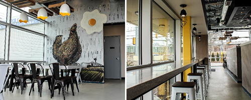
Natural elements like wood and slate are very popular right now, according to Hannah Weiner, interior designer at Phase Zero Design in Boston.
“The trend is to create cozy, rustic, authentic spaces that lend an almost ‘mom and pop’ feel,” she says. “The effect is created by starting with 85 percent of neutral colors — mostly black contrasted with grays and whites. Once that neutral palette is laid, pops of color are added on accent walls, banquettes, upholstery, pillows and wall décor to give the space a warm feeling.”

Crack’d is a culinary-driven eatery in Andover, Massachusetts. Phase Zero Design incorporated a “mom and pop” vibe by utilizing murals, grays and pops of color.
Muted Pastels
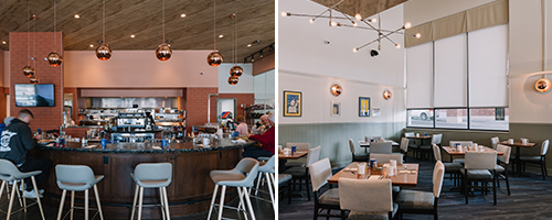
Tanya Spaulding, principal at Shea Design in Minneapolis, sees restaurant design color going from an industrial, dark and heavy vibe to a lighter, more colorful one.
“Designers have been using gray as a primary base for restaurants for a while now, but I’m seeing that transform into muted pastels instead,” she says. “Incorporating these colors into smaller areas, like on a private dining room wall or on pillows, provides energy and life to a space, and can easily be updated every few years for a fresh look and feel.”

Benedict’s is a breakfast diner in Wayzata, Minnesota. Shea Design specified muted pastels to evoke a midcentury style.
Plants
Another trend restaurant designers are seeing this year is the incorporation of indoor plants.
“Biophilic design — a way to connect people in a building to nature — is very popular right now,” says Alicia Kelly, senior interior designer at Studio K in Chicago. “There’s a new emphasis on sustainability and nature, so designers are using leafy greenery, succulents, air plants and trees as essential elements.”
Beyond Trends
Restaurant designers pay attention to what’s trending in dining décor, but most focus on creating a custom experience for the brand and the space.
“We actually like to avoid trends and go with what is unexpected,” Kelly says. “It’s more about creating a mood and telling the story of a particular chef or owner. Colors create feelings and energy, so we focus on the atmosphere first, choosing colors that can evoke the mood for daytime or nighttime dining.”
Weiner agrees, noting that not all restaurants can be designed in a cookie-cutter way. “Many of our clients have strong identities already,” she says. “So our job is often to use their brand colors in a unique way to create the atmosphere they want to achieve.”

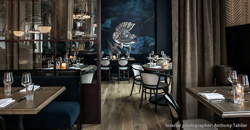
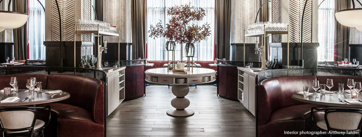
Bellemore in Chicago exemplifies chef-driven restaurant design. Studio K designed the interiors to suit the restaurant’s “artistic American” cuisine.
Photos: Anthony Tahlier.
Spaulding adds that the way people and food look in a dining space is of utmost importance, too. “There’s a rule of thumb that blue is not a great color in restaurants because it doesn’t make food or people look good,” she says. “But there are darker blues that can actually lend the saturated, moody look that some clients want. Warm, glowing colors work well in restaurants, but if they get too bright, it can reflect poorly on the guests and the food. So, you don’t need to go one way or the other — you just need to be cognizant of how all of the colors work together.”
Bringing Restaurant Trends Home
With the increasing popularity of dining out, design elements that guests see at restaurants are often inspiration for their own kitchen and dining areas. Spaulding says, “We get quite a few calls asking for the particular paint color of one of our designs. Often it’s a simple gray or dark green, but the way we used it in the space makes people fall in love with it. If they had just seen a swatch of it, they might not like it as much.”
Spaulding emphasizes that restaurant design is about creating an entire experience, so even if a guest likes a wall color, it’s all of the colors working in concert that creates the ambiance. “The same rule applies to home design,” she says. “No matter what color you use, it’s about creating an overall look.”


