By Kitty Shea
It's a fact: As we age, our visual decline affects our reading of color. Vision expert Marilyn Schneck reveals how these issues should influence color decisions when designing for the elderly.
The baby boom generation — people born during the post-World War II era (1946 to 1964) — are currently anywhere between 50 and 68 years old. All but the most visually blessed have likely experienced blurring when trying to see things up close, such as the fine print in an instruction manual or newspaper. The cause is presbyopia, the age-related condition in which the crystalline lens of the eye loses its flexibility and elasticity, making it difficult to focus on close objects.
Research published in the March 2014 issue of Optometry and Visual Science, the journal of the American Academy of Optometry, foreshadows what's next for boomers. The findings contain important insights for those who specify colors in spaces that serve an elderly population.
A boomer herself, author and elder-vision expert Marilyn Schneck, Ph.D., is a scientist at the Smith-Kettlewell Eye Research Institute in San Francisco. Schneck has been tracking a group of 900 subjects for more than two decades, testing 200 of them at four-year intervals for nearly 20 years. She uses highly specialized behavioral tests to measure how her subjects' eyesight has changed over time.
While smoking, diabetes and genetics contribute to visual color decline, aging is itself the prime culprit, and not just in one's later years. According to Schneck, the lenses in your eye start yellowing at birth. It's just that the changes are so gradual, they're imperceptible for a long time.
"As we age, we still 'see' white paper as white; our visual system is able to recalibrate for it. We 'know' paper is white, even if to the eye it really appears ivory," says Schneck. But over time, the yellowing of the lens reduces its transparency, causing it to become more opaque and reduce the elderly's ability to discriminate certain hues.
Here, Schneck shares the results of her research and how they apply to choosing color for senior spaces, including healthcare settings.
Finding: Nearly half of Schneck's subjects in their mid-70s and two-thirds in their mid-90s confused pale colors in the blue-green region of the spectrum with other pale colors. Blue and green become more difficult to tell apart than red, yellow and orange, which Schneck attributes largely to the yellowing of the lens.
Application: "If you took a healthy young person and dimmed the lights enough, they would start producing the same blue-green errors as an older person does under bright light," says Schneck. So exercise caution when specifying blues, and make sure the space has adequate lighting.
Carolyn Noble, designer marketing manager for the southeast division at Sherwin-Williams, couldn't agree more: "When designing with the aging eye in mind, pay careful attention to lighting and light levels. A lighting system should include ambient lighting as well as specific task lighting to enhance color perception. Adding dimmable lighting is an easy way to maximize color rendering. And consider specifying blues with deeper saturation levels such as Resolute Blue (SW 6507) or Respite Blue (SW 6514), as they'll look less yellow than a grayer blue would."
Finding: Pastel hues that look distinct to a young person can look very similar to an older person. "If they were to give the color arrangement test to older people, young interior designers might be quite surprised by the errors their test subjects make," says Schneck. For example, confusing reddish-orange with blues.
Application: Use rich, saturated colors whenever possible. If using pastels, avoid going from one to another, particularly when demarcating transitions such as stairs. Contrast via alternating light and dark hues is especially important for these surfaces to aid in depth perception.
Finding: Blues that are dark to begin with appear even darker to an older audience. The navy blue versus black sock conundrum becomes much more pronounced in the elderly. "Older people can still see blue and call things blue, but it's darkened considerably," says Schneck.
Application: Schneck has done testing in eldery people's homes and invariably found them to be too dim. "Their pupils are smaller — another effect of aging — and they have amber-colored lenses. So visually, it's as if they're wearing sunglasses in the house," says Shneck. Increase the lighting while being mindful that excess lighting can cause glare, which Schneck says must definitely be avoided for older people, whose eyes are more susceptible to it.
Adds Noble: "Something that's easy to overlook but that has a tremendous effect on the aging eye is the paint sheen you select. A higher sheen may intensify glare, which can further distort the color. Using a matte or flat finish would be a better choice."
Eyeing Glasses
Not only will readers help you see better, their colorful frames can make you look better, too.
Time does a number on color, and not just on our perception of it. As we age, our faces lose color, too, becoming paler and more washed-out-looking. Which is why style-minded boomers wear statement reading glasses.
"As we age, the color drains from our faces, so we need ways to bring it back. That's why, for women, lipstick becomes more important and why they often dye their eyebrows along with their hair," says Julie Allinson, founder and president of Eyebobs in Minneapolis, which designs and markets stylish reading glasses.
Eyebobs is all about color. "We don't often design clear or rimless frames for women. Women need that rim to provide the color. It used to be you wanted to make your glasses unnoticeable. Now, it's just the opposite," says Allinson. "The first thing you notice on a face is color. The style of the frame is secondary."
Of all the drags that accompany aging, presbyopia actually has an upside: It's a medical excuse to go shopping for fun, stylish, colorful readers. And your collection, due to the relentless aging process and the need for stronger lens power, will require regular updating.
Eyebobs obliges by offering new picks seasonally, with Allinson likening the reveal of new frame colors to Sherwin-Williams unveiling its annual colormix™ palettes. Eyebobs originates some of its own colors and relies on its Italian plastic-maker for the rest. "We always have red and lots of tortoise in the line, tortoise being a staple in eyeglass colors, like white is for paint colors," says Allinson.
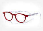
"Eyewear today is a fashion piece,” says Allinson. Contrast them with the colors of your clothing versus going monochromatic. Try spicing up all-black attire with a red frame, which has the added benefit of bringing out warm tones in the skin.[Women's Bitty Witty 2864]
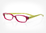
"I know what's current or coming in fashion, but I don't let it push my buttons completely," says Allinson. While yellow has been a big runway color recently, "yellow can be a tricky color to wear on your face. It can make you look jaundiced." Yellow-influenced temples, however, are fine — and fun. [Women's Eye Catcher, Color 45]
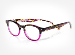
Typically, the darker the complexion, the more richly colored the frame can be; pale frames don't work on dark brunettes. Don't be afraid to go vivid. "Once somebody tries a frame that's a little outrageous for them, they come back and say, €˜I get stopped all the time about my glasses!" says Allinson. [Women's & Men's Roy D 2890]
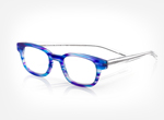
Blue is big lately, and an easier transition for men graduating from their black and tortoise comfort zones. "Blue allows the traditional person to step out," says Allinson. New this year from Eyebobs is tortoise with a navy base for both genders. [Men's & Women's Butch 2249, Color 10]
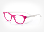
What's in style right now are bold, retro frames that are meant to be seen. This pair, thanks to the subtle lift at its edge, draws the eye upward for an economical facelift. [Women's Sugar 2884, Color 45]
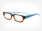
Reimagined in a modern color palette, thick unisex frames with a vintage feel are daring yet safe. "Because they don't wear them all the time, it's easier to get men to commit to color with reading glasses," says Allinson. [Men's & Women's Peckerhead 2275, Color 16]
Have questions about color perception and the aging eye? Tweet us, @SWDesignPros, using #SWStir.


