By Holly O'Dell
Creating an eye-catching effect on walls, furniture and more by smoothly transitioning a color from a light to a dark shade.
Check out any recent red carpet event or late-night talk show, and you'll likely see a celebrity with ombre hair: a duotone style where the roots remain dark and the hair gradually transitions to a lighter shade. However, ombre, French for "to shade," isn't relegated to the beauty industry. Interior designers and painters are employing the technique, in which a color gradates from light to dark, or vice versa, to create a subtle yet unique effect.
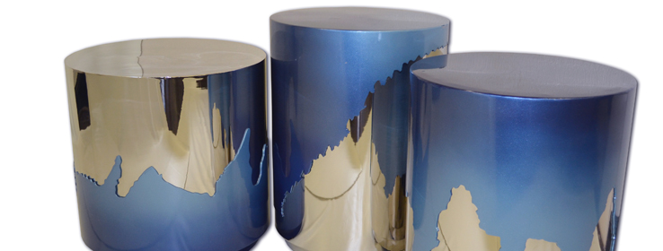
In May, for its booth at Hospitality Design (HD) Expo 2014, Los Angeles-based Pacific Hospitality Design Inc. showcased custom metal and wood furnishings that used Sherwin-Williams® Product Finishes to create a gradient running from a rich cobalt to a very light blue.
"I like how ombre uses the same hue for a monochromatic look," says Ana Maria Martinez-Stumpo, a furniture designer and vice president of Pacific Hospitality Design. "I also like bringing fashion to furniture, and the ombre look we're seeing with hair is beautiful when applied to furniture."
With a background as a decorative painter, interior designer Marina Klima Goldberg of Klima Design Group in Morganville, New Jersey, has used the ombre technique on everything from drapery trim to air vent covers. "Ombre is more than a trendy fad," Goldberg says. "It can be used in any setting — traditional or modern. The effect is subtle, so it's hard to get tired of it."
Many designers are using the ombre technique to bring character to forgotten or traditionally drab spaces. Teri Pollard, ASID, IIDA, CID, interior designer and principal at Designworks Morgan Hill in Morgan Hill, California, has implemented ombre to bring depth to staircases. "Ombre gives visual interest to a staircase in a place that might otherwise just be a way to get from one floor to the next," Pollard says.
"When you pick up paint chip cards at the paint store, the manufacturer has already done the grading for you with three to five colorways on a card," Pollard says. She suggests selecting at least three of the colorways. She also advises starting at the top of the steps, painting two risers each color and transitioning from very light to dark. "If you use the lightest color at the top, it will feel like you're going toward the sky," Pollard says, "and if you use the darkest at the base of the staircase, then it feels grounded."
Pollard applied the same principle to full-height, tongue-and-groove wood paneling in a vacation home to update a dark room. Pollard first applied primer on the paneling, then painted two panel widths at a time, using warm white, sandy beige, dark linen and potato skin, and repeating.
"This treatment added brightness, rhythm and interest to lackluster paneling," Pollard says. "I found linens in the hues I used on the panels, and it changed the whole feeling of the room."
Tips on technique
A successful ombre treatment is dependent on mixing the paint and glaze correctly to achieve the right proportions and consistency. Goldberg suggests practicing on samples first. She typically primes a 20" x 30" piece of cardboard and starts to experiment. She places blue masking tape on the cardboard, paints over it, then takes it off right away and uses a brush to smudge the distinct line and soften the gradation. "Think about it as if you're doing makeup for a smoky eye look," Goldberg says.
In addition to paint, designers have achieved the ombre look through fabric-based treatments such as wall coverings and upholstery. While Martinez-Stumpo has found fashion fabrics with an ombre treatment, these materials don't generally stand up to upholstery uses. "Instead, we'll find different fabrics in the same hue that go from dark to medium to light, and cut and sew them into a gradation," she says.
Next on Martinez-Stumpo's list: experimenting with plating finishes. "I'm thinking about a piece that goes from a brass to a pewter to a chrome, or starting with chrome and ending with glass," Martinez-Stumpo says.
Whether achieving color gradient on a wall, furniture, drapery or decorative element, "you have to be careful that the shade change is subtle," Pollard says. "Otherwise, it will look more like a banded treatment than ombre."


