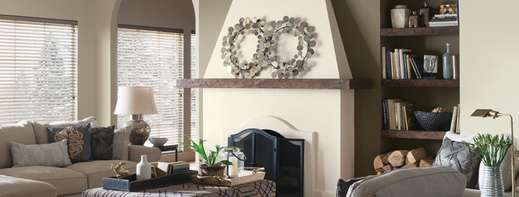
Sue Wadden shares her expert advice on managing undertones to create perfect color palettes.
By Amanda Lecky test
If you’ve ever found yourself staring at a freshly painted room and wondering where your color picks went wrong, you may be the victim of mismatched undertones. Here’s a quick brush-up on the basics of undertones and some tips on how to use them to create winning color combinations.
Mass tone vs. undertone. Whenever a color is made by mixing two or more colors together, that color will have both a mass tone and an undertone. The mass tone is what you see first; it’s what tells you the color is red, blue, green and so forth. The closer the undertone is to the mass tone, the truer the color will appear. So a true red will have a mass tone and undertone that are very similar, but magenta will have a blue undertone, while poppy will have an orange undertone. To understand the undertones in the colors, neutrals and whites you’re considering, and to solve your undertone problems, follow Sue’s expert advice:
Don’t look at colors in isolation. “If you’re just looking at a white by itself, it will probably just look white. But put it next to a pure white and you’ll see how it differs — the green or pink or blue undertone will show up in comparison,” Wadden says. You can use this trick with any color: Just put the color you’re considering next to a pure example of that color (if you don’t have one handy, use a color wheel); the undertone will quickly reveal itself. Another option that works particularly well with light neutrals and white: “Look at the mid-to-darker colors on a let-down strip — it will be much easier to identify the undertone than the paler colors at the top.”
Consider color temperature. Warm colors typically have undertones that are orange, yellow, or red, while cool colors have undertones that are green, blue, or purple. If you don’t want to analyze the undertone too intently, just figure out if the color looks warm or cool to you, and what kind of mood you want your space to have. Warm colors tend to create an atmosphere that’s cozy or energetic and cool colors often appear fresh and soothing.
Look at the lighting. How much and what type of natural light a room gets can have a big effect on the undertones that come out of a color. Blue northern light will emphasize blue undertones; golden southern light will make colors appear creamier. Electric light is equally important. “Colors will look totally different under yellow incandescent light versus green fluorescent light,” Wadden says. “You can change the colors you’ve chosen, or just change the lightbulbs if you’ve made a mistake.”
Strike a balance — or don’t. Common decorating advice is to balance out warm and cool elements in a room. But there are no hard and fast rules, Wadden says. “If I were choosing paint colors for a Craftsman-style house with a lot of warm wood tones, I’d probably pick a cool paint color like blue to balance all that warmth. But someone else might want something like gold, to really emphasize it.”


