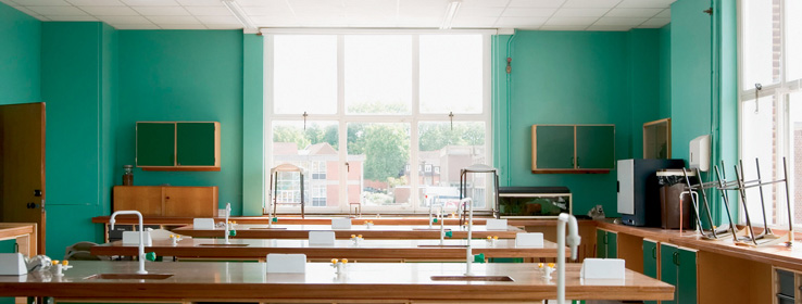
How schools are using color to create ready-to-learn environments.
Classroom decor can range from the crayon-bright interiors of preschools to the gray terrazzo floors and white-washed block walls still seen in many old high schools. When it comes to learning, does color matter?
The current consensus is that what a student hears, feels and smells has a significant impact on his or her learning. Brain-based learning, the latest buzz in education, is, at its core, learning via the senses.
"We know that color is one of the key elements in a stimulus-rich learning environment," says Randy Fielding, chairman of Fielding Nair International, a Minneapolis planning and design firm specializing in education environments. According to Fielding, founder of DesignShare.com, a resource for designers of learning environments, research shows that students learn best in color-filled settings.
"A well-planned palette offers a broad range of colors," he says, including serene blue or green shades combined with more stimulating reds, oranges or yellows. "Utilizing lighter tones in combination with deeper accent colors creates a dynamic sense of place."
Functional color, which prioritizes educational results before aesthetics, focuses on such learning enhancements as reducing eye strain and increasing attention spans. For the majority of students, high contrasts are stimulating, while lighter tones can promote focus. One study even indicated that monotonous color schemes increase the rate of student absenteeism.
The key to creating ready-to-learn environments, says Fielding, is a variety of colors and a range of color intensity, including some hues used as way-finders and culture-builders in common areas.
"In a cold climate, warm, earthy tones invite students and teachers to nestle into a cozy cafe area, for engaging in both reflective and collaborative learning," he says. "In warmer climates, a cooler palette in a cafe or gathering area can invite students to relax and flex their interpersonal intelligence."
Fielding also debunks a few commonly held assumptions about color's impact. "Red doesn't hyper-stimulate," he says; too much soothing green may dull, rather than relax, the senses. And bright primary colors, long presumed to be elementary-age favorites, can be too harsh and should be used only sparingly. "Children are wonderfully sensitive to nuances in both lighting and color," he says. As for which specific colors work best, Fielding doesn't discriminate. "All colors," like all students, he says, "are good."
For more information about color and learning, visit:


