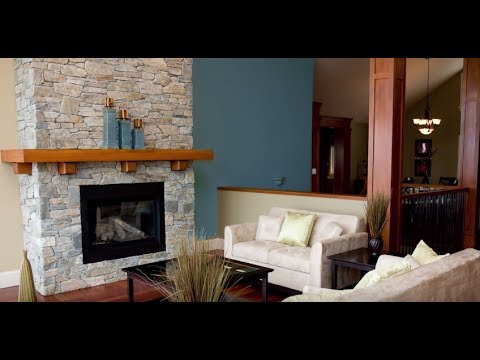
Michelle Gringeri-Brown talks about the ranch home's use of color and how to update it for modern living.
STIR: You refer to ranch-style houses as the "architectural stepchild." Why do you think ranches get no respect?
MGB: They're too recent to have historical cachet; they don't necessarily appeal to the architectural snob. Some people think ranch-style houses are boring or ugly. Their curb appeal is a little more subtle, shall we say. But they're livable houses with interesting attributes. They live bigger than their footprint.
STIR: Are younger nesters more appreciative of ranch houses than their parents?
MGB: Absolutely. There's a big nostalgia factor. Our publisher calls it "the Grandma Complex."
STIR: How would you describe the original color palettes for ranch-style homes?
MGB: Bungalow colors are pretty easily defined, but ranch-home colors are more difficult to define. Some people are doing historic renovation, going through layers of paint to see what colors were originally used. In general, the colors are a little lighter, a little more exuberant in postwar homes. They're not as deep and dark as the bungalow palette.
STIR: Did colors vary by geographic region?
MGB: They varied by style of home, depending on whether it's a traditional ranch or a modernist home. In general, there are three color categories. There were "Eichler colors" [California builder Joseph Eichler], which were muddy colors from nature, like putty, gray, greens and browns and, dare we forget, avocado, harvest gold and copper. These were neutrals that worked with the home's surroundings, and you see them most often in modernist homes. You might see a door in "Eichler orange" – a bright pumpkin. In Florida and southern California, the colors were more fun and vibrant, with turquoise, hot pink and yellow used as accents. These were vacation homes, and there's a different quality of light in those coastal regions. Then there were the traditional homes, with more traditional colors, including off-white and brick red – colors that reflected natural materials, such as flagstone, brick and cement floors.
STIR: Do these color patterns correlate to the era in which the homes were built? Your magazine and book cover the years from 1945 to 1971. Was there a color evolution over that period?
MGB: The 50's were more traditional, with little Colonial touches and safer colors. You still see the white gallery look, as well as exposed beams and redwood floors. There was an evolution in the 1960s and 1970s to get in touch with nature, which translated into a folk-art-driven color palette, such as earthy macramé weavings from Africa. The modernist homes were built primarily in the 1960s.
STIR: What color palettes work well in today's updated ranch-style homes?
MGB: It's a good era. It lends itself to a lot of applications. If you like bright, pop-arty things, you can do that and it looks cool. Or you can go neutral, with black and tan furnishings against off-white walls.
STIR: What are some color resources for design professionals and owners?
MGB: Sherwin-Williams has a Suburban Modern palette. The interior palette includes pastels, but sort of punchy, like chartreuse paired with pink and gray. It has a fun tropical flavor. The exterior colors, I see as similar to bungalow colors: nice gray, muddied colors, including avocado. Some people find a vintage fabric and work from that. Fabrics give good color cues.
STIR: Are there any color do's and don'ts when trying to update a ranch-style home?
MGB: You want less color contrast than you find in most older homes, where you often see a trend to off-white crown molding against vibrant walls. Midcentury modern is also about contrast, but it's a little more muted and sophisticated. The contrast comes from working within a given palette using different textures. And the modernist home generally had so much glass that there's less interior wall space. You focus on the outside; that becomes the palette. We encourage people to look for color continuity, between the kitchen and the dining room, for example. With open floor plans, using all the same color gives you much better spatial flow. If you want accents and variety, do it with cabinet faces and artwork, as opposed to different wall colors. Although you might use an accent wall in tomato or avocado green to light up the room.
STIR: What if you have a permanent architectural feature in a color that screams 50's or 60's — how should you update the palette?
MGB: Before you decide to change something major, live with it a little. Maybe you have a peach and turquoise bathroom or a pink kitchen that you think you don't like, but give it a chance. You might learn a new color and style language. Try and appreciate it before ripping it out and putting in granite or a modern kitchen that will look dated in 10 or 15 years. Depending on where you live, there's growing appreciation for midcentury homes that have retained their original elements, such as knotty pine paneling or original countertops. Here on the West Coast, the homes that sit on the market are the ones where the owners from the 80's or 90's ripped out original kitchens and bathrooms and made them more generic. Paint is simple to change, but think twice about making major changes to harder materials that are not easily replaced.


