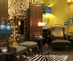
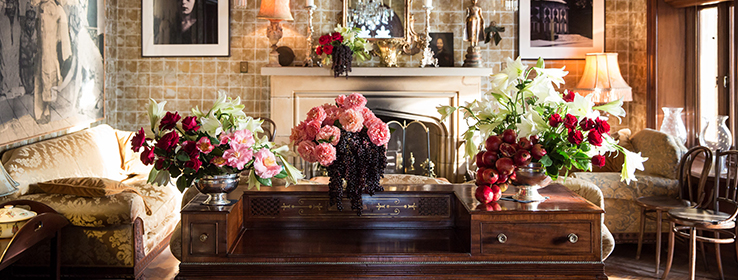
“Big, bold and beautiful” could be the catchphrase of maximalist design — a movement that doesn’t shy away from busy prints and contrasting patterns. Pull off this “big” design with these paint palettes and design consideration tips.
By Megan Swoyer
Maximalist design. How to best describe this opulent style? It is, in fact, a bit of everything: Decadent, excessive and overstated, but also spirited and absorbing. After years of taking a backseat to its counterpart, minimalism, this “big” design style is making its comeback. That’s what Sue Wadden, Sherwin-Williams Director of Color Marketing, discovered at this year’s Maison & Objet, the foremost home décor, interior design and architecture tradeshow in Paris.
Maison & Objet showrooms were awash in this no-holds-barred maximalist approach. Attendees took in bold paint colors, flashy wallpapers, and coatings of dark hues and rich color. Although maximalism can feel like “a bit much,” it can also be charming, cozy and stylish — and a great way to bring out your client’s personality and interests through décor.
And that’s the key to maximalist design: Allowing individuality to reign supreme. New York–based interior designer Libby Langdon says that unlike minimalism, you definitely get an idea of the homeowner’s persona when entering a maximalist space.

Let personalities shine
Individuality is key in the Michigan home of estate-sale expert Cari Cucksey of HGTV show Cash & Cari. “I mix a variety of styles and periods and tie it all together with accessories and color,” Cucksey says of her home, which is the second floor of an 1800s bank building. A collection of vintage Fiestaware shares space with an antique dowry chest, while mid-century modern pieces add eclectic intrigue. One hall is decked with photos of her family, each in large antique frames from her grandparents that Cucksey painted in saturated hues. “A well-curated home paints a true picture of the owners. And in my home, every piece tells a story or, in most cases, an adventure.”
When clients tell Langdon they don’t want their house looking like everyone else’s, the designer will pull the maximalist card out of her style deck. “It’s a way to create a design that echoes what people love and who they are,” Langdon says.
The elements of maximalist design are all about the art of blending. “I use small mobile ottomans that don’t take up a lot of space, with a crazy fabric, bold drapery patterns and mismatched end tables,” Langdon says. “Balance is not your friend and nothing should match, but it all needs to work together.”
In addition, a gathering of collectibles plays as important a role as the mismatched furnishings. “And sometimes, those collections can be a challenge,” says Langdon, who recalls a client in Texas with an “explosive collection of china dogs.” The solution? Commit the collection to only one area and go vertical with floor-to-ceiling display shelves. “Have one big massive wall so you don’t dilute the impact.”
She also recalls a client with an antique typewriter collection. “It was mounted from floor to ceiling on the wall, like a hanging sculpture … it was awesome.”
Max on the walls
As for choosing wall colors, consider the conversation between the elements in the room. “Building a maximalist room is done in layers,” Langdon says. “There’s no one thing that makes it feel full. It’s layer upon layer, and paint is an important foundation for what you’re going to put in front of the walls. There needs to be a back-and-forth between your paint and your furnishings, fabrics, rugs, accessories, et cetera.”
Langdon likes to shake up an accent wall with a rich shade, like red. “We’ll use a room-to-room neutral for stairwells, hallways and areas that connect rooms, like Analytical Gray SW 7051 or Passive SW 7064, but then we’ll add a bold wall, like Red Bay SW 6321, which is livable because it’s a dense color with quieter undertones,” Langon says. “I like a matte or a flat finish — it looks more velvety and feels dense.”
Accent walls should always feature artwork, a shelving unit or another accessory to create depth and dimension. “I often will keep all the walls in a maximalist space dark and moody, so the environment blends together as a cozy cocoon,” says Anne Strickland, designer and owner of PORT Mfg. & Design in Michigan.
Big, bold trim
For trim colors and finishes, it can be anything goes for maximalism. High gloss will add glam, while matte will recede, so choose what works best with the room. “If the moody dark color happens to be a grasscloth wallcovering, I’ll have the trim and ceiling painted a dark color in a contrasting finish to make the space seem more custom,” Strickland says.
Langdon prefers a high gloss. “That gives you another opportunity to add zip,” Langdon says. “I’m crazy about a high-gloss black trim or a rich navy trim. Those trim colors set the architectural lines of the room and allow you to build out from there.”
Langdon warns, though, that maximalist design should never cross the line to “fun house.” “You want the space livable, and that’s a matter of committing and announcing your own personal style,” Langdon says. “A lot of times, clients may want maximal design, but they’re not sure what their style is, and as designers, we decipher and coax it out of them.” In the end, it’s all about creating spaces that seem to sparkle with emotion and personality. “They should make homeowners feel happy the second they walk in.”


