Working With Colors
Color is infinitely abundant and amazingly diverse— appearing in everything from an endless sky to a grain of sand. Even more fascinating, color has an extraordinary ability to stir emotions and inspire ideas. Perhaps that’s why we all have our favorites. Explore these color families and discover what makes each one so captivating.
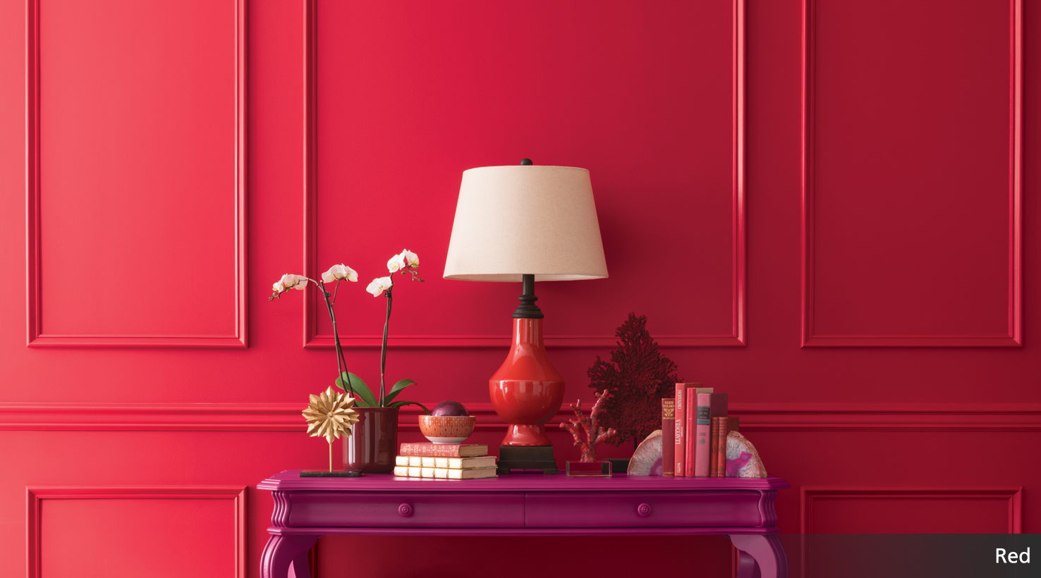
Red
There’s no mistaking the power of red. It’s fast, sporty and fiery. But it can also be as soft and delicate as a begonia blossom. Or have the grounded, earthy appearance of a fired brick. So why not use red with another red? The effect is sure to stop you in your tracks.
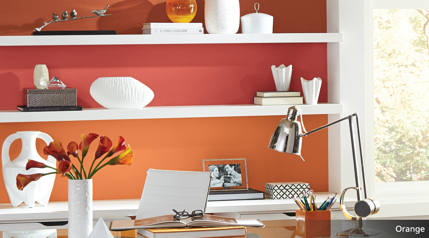
Orange
From the fresh-squeezed sweetness of tangerine to the warm glow of copper, oranges bring a zesty energy that livens up a space. If an entire room of bright citrus is too bold for you, try orange as an accent. Your fun, spontaneous personality will surely shine.
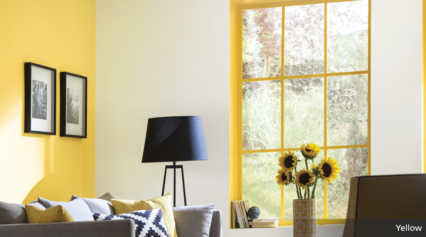
Yellow
Whether your taste for yellow is more buttery, lemony or mellow like mustard, incorporating yellow into your palette adds a warm, sunny optimism that can chase any worry away. To help regulate yellow’s overall intensity, try pairing it with warm gray.
Green
Green can suggest a youthful, energetic vibe as evident in bright, tropical lime greens. Or it can be calming and contemplative like the deeper hues of a dense pine grove. This versatility makes green a very livable color family.
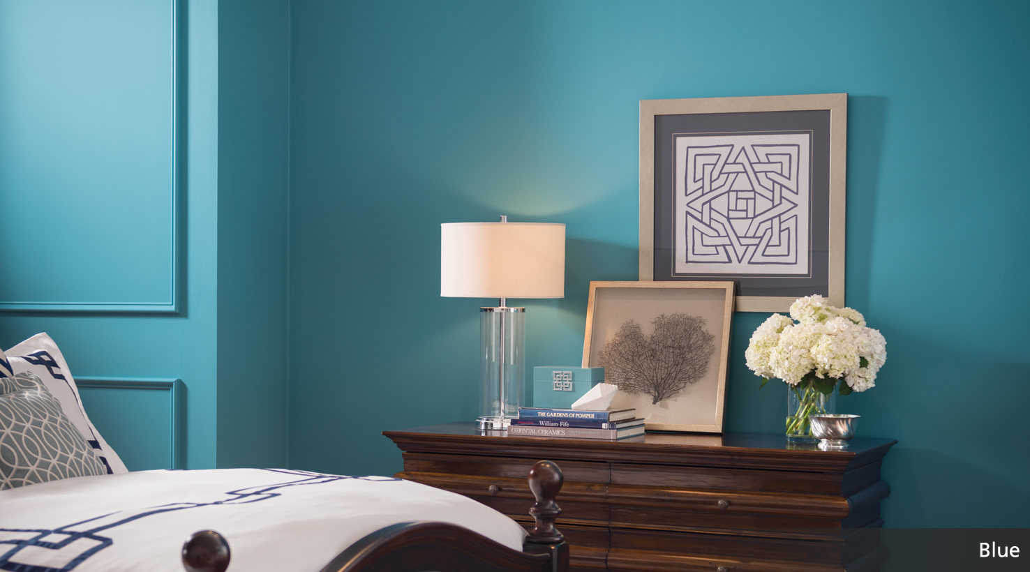
Blue
Like the iconic denim jean, blue is cool, comfortable and classic. Dress it up or go completely casual. Blue looks good in any fashion. To make a statement, think deep, dark and bold. Choose watery or dusty hues for a feeling that’s more relaxed.
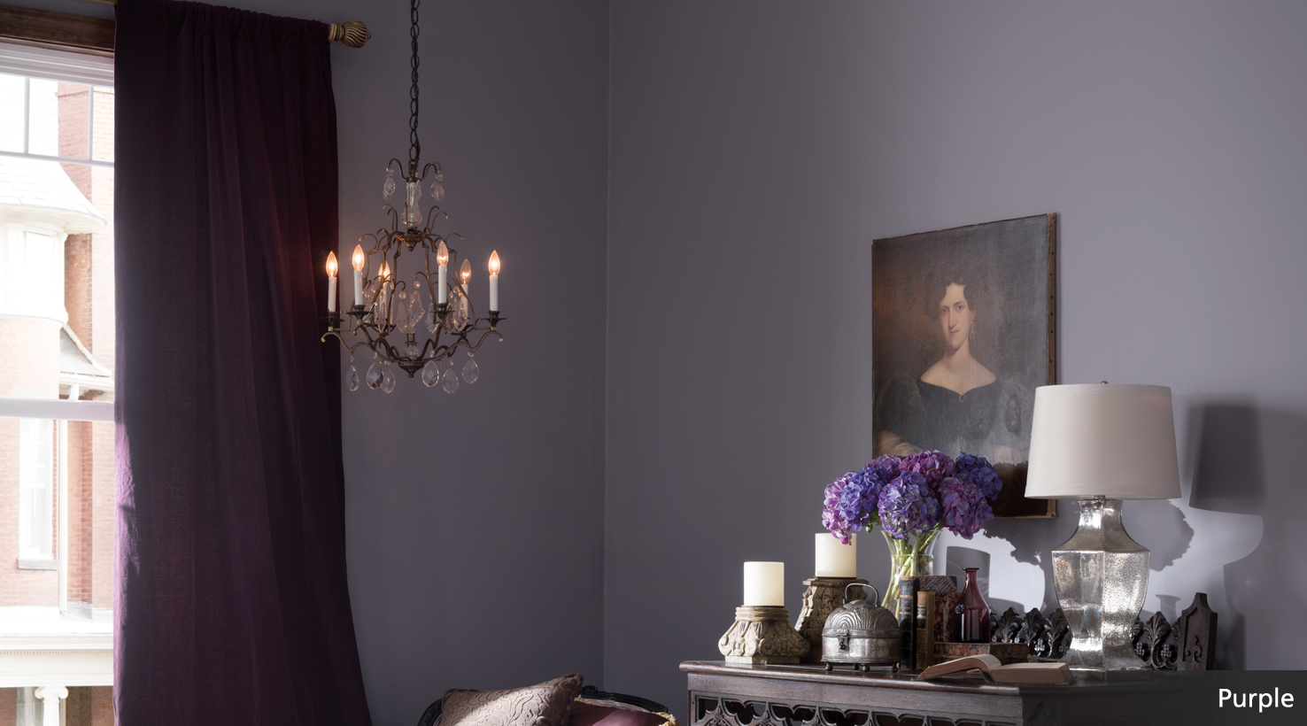
Purple
Lush. That’s purple in a word. A long-standing symbol of royalty, purple carries a regal, sophisticated tone. But you’re not limited to the rich, decadent ambiance of deep purple. Pair a brighter hue with crisp black and white accents for a more youthful vibe.


