Color Collection - Market Colors
Previous Year: 2018
Commercial Color Collection
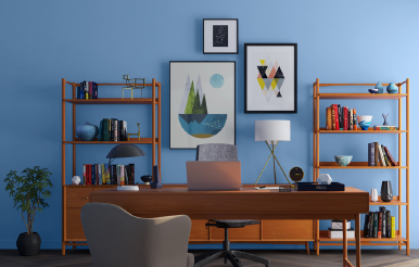
Sweet Retreat
A modern update to classic pastels, the Sweet Retreat palette provides versatility. The light, airy colors help make the office feel like home and work seem like play.

Power Play
Inspired by modern tech, this bold palette is filled with daring colors that generate a futuristic energy. Contrasting the shades with simplistic interiors, the Power Play palette can transform any space into a work of art.
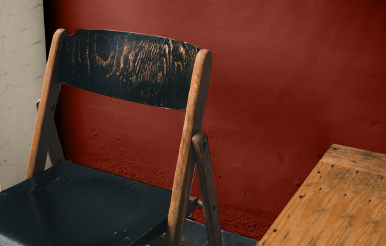
Natural Ground
Simplistic and rural, the Natural Ground palette brings comfort into offices and retail spaces. The rich and complex colors pair seamlessly with wood, stone and brick.
Hospitality Color Collection
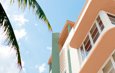
Retro Revival
A mix of eye-catching pastels combine to create the playful Retro Revival palette. Nostalgic shades provide a fresh take on retro motel décor and add a perfect splash of color both inside and out.
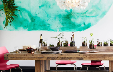
Electric Exploration
Bolder is better with the bright, striking colors of the Electric Exploration palette. The vivid travel-inspired shades create an aesthetic that explodes with energy and life.
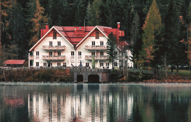
Off the Grid
The Off the Grid palette is a breath of fresh air. Drawing from rustic western heritage, the colors reflect forests, deserts and other earthy elements of the great outdoors.
Healthcare Color Collection
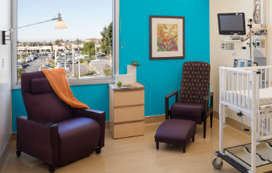
Upbeat Energy
Fun-focused and lively colors make up the Upbeat Energy palette. These saturated pastels promote inspiration and motivation.

Connected Calm
Accent patient and staff rooms with soft natural tones found in the Connected Calm palette. Leading with cool greens and blues, the hues evoke a feeling of familiarity and relaxation.
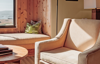
Cozy Living
Achieve the next level of luxury with the deep and sophisticated colors of the Cozy Living palette. The earthy colors transform a space to create a sense of home.
Education Color Collection
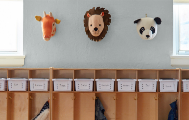
Nurtured Nature
The soft, chalky colors of the Nurtured Nature palette form a sensory connection to the outdoors, ideal for a learning environment. An organic, neutral aesthetic encourages concentration from students at any age.
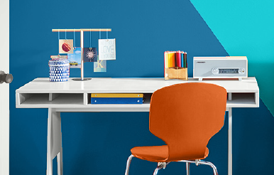
Bright Futures
Bold and bright pops of color act as a wayfinding tool, perfect for guiding students from classroom to classroom. The colors in the Bright Futures palette add visual interest and energize school spaces.
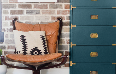
Global Student
Statement colors in the Global Student palette pair well with brick, stone and wood to evoke a rustic aesthetic. The globally influenced hues come together to make a statement and inspire curiosity.
Multi-Family Communities Color Collection

Outdoor Reflection
Inspire relaxation with calming tones from the Outdoor Reflection palette. Taking a cue from breathtaking landscapes, these colors express freedom and a feeling of serenity.
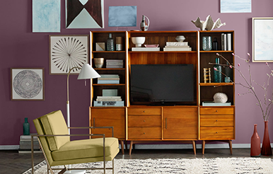
Modern Vintage
Old meets new with this eclectic mix of modern and vintage-inspired hues. Evoke nostalgia through the Modern Vintage palette, with shades that provide a warm welcome to both past and present.
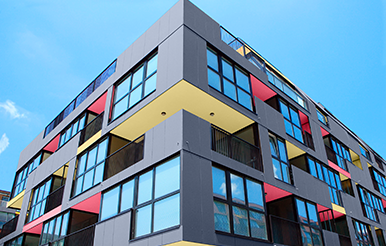
New Energy
Attitude is the best accessory for this collection of bright and airy colors. From the social-savvy to the free thinkers, the New Energy palette embraces confidence for every style.
New Residential Color Collection
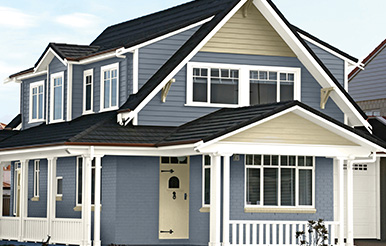
Cosmic Radiance
Inspired by both the calming colors of the earth and the cosmic hues of the beyond, this palette includes earthy neutrals complemented by atmospheric wisps of color. Combining colors related to the earth, space and technology, it evokes a sense of mystery and thoughts of conquering the final frontier.
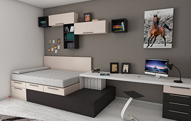
Sophisticated Floral
This palette infuses deep rich florals with unexpected bright pops of color. Inspired by greenhouses and conservatories, it reflects a desire to be close to nature.
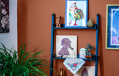
Rustic Comfort
This collection of warm, rustic desert tones was inspired by the New West. The combination of earthy tones reminiscent of leather, denim, terracotta and natural blues provokes feelings of freedom and a desire to explore.
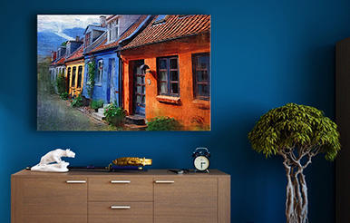
Nostalgic Brights
These bold, rich and vibrant colors exist to make a statement. Bright pops of color contrasted with stark neutrals conjure energy, passion and nostalgia.
Residential Repaints Color Collection
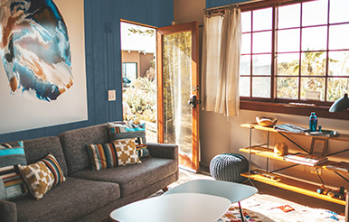
Fractal Heirlooms
The Fractal Heirlooms palette is reflective of our desire to travel the world and gain a different perspective from a new culture or place. The muted tones cultivate an inviting atmosphere complementing natural accents, an array of fibrous fabrics and warm metals.
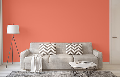
Nuanced Classics
A rejuvenating twist on traditional design uses vibrant colors to reenergize a classic style. By introducing these bold tones, this palette reflects our age-old desire to achieve refinement and perfection.
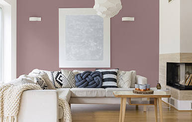
Mindful Impact
This palette of pastels is inspired by the desire to reflect, find balance and make an impact in a world driven by technology. The transitional hues in the Mindful Impact palette reflect not only the calming nostalgia of the past, but the promise of a positive future.
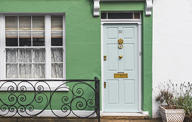
Instinctive Nature
These natural tones are inspired by the flourishing trend of bold botanicals and vibrant florals. This palette utilizes rich organic hues that complement a variety of natural wood finishes, marbled elements and warm metal finishes.


