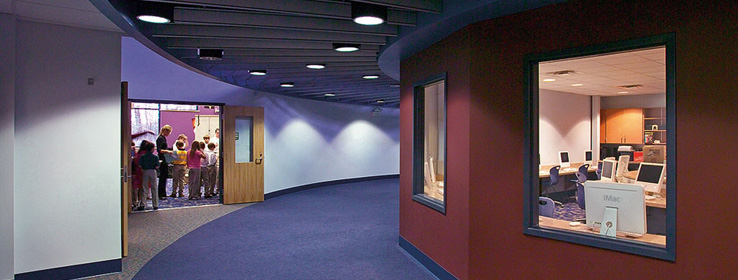
Rich, vibrant color was part of the equation that transformed a Michigan office building into a green learning environment.
When the parish of St. Patrick Church in Brighton, Mich., decided to expand its school, church members explored the usual options first: adding on to the existing building or purchasing land upon which a new structure could be erected. But in the end, the church made a bold and unusual choice: They bought a 36,000-square-foot former General Motors office building and renovated it to create the only kindergarten-through-eighth-grade green private Catholic school in the nation.
"It was the project of a career," says designer Lisa Whalls, vice president of Facility Matrix group and the parent of a student who attends St. Patrick School. "We were creating a learning environment that was a complete paradigm shift for a private-school education. All the light that's filtering into the school and the choice of colors are so nontraditional. And the fact that we were not only renovating a former office building, but doing so in a green way – we knew we were doing something spectacular."
The school's green features include a high-efficiency HVAC system estimated to reduce long-term energy use by 30 percent (in part through sensors that detect when a classroom is empty and move the room to "unoccupied" mode), GreenGuard-certified carpeting and furniture, water-efficient plumbing fixtures and waterless urinals, and low-VOC (volatile organic compounds) Sherwin-Williams paints.
"The biggest green aspect was buying an already existing building in the city, which saved utilities having to be brought out outside the city and cut down on driving for parents," says David Richardson, project architect and a partner at Lindhout Associates in Brighton. Richardson became the first architect in Livingston County accredited by LEED (Leadership in Energy and Environmental Design). Richardson is waiting for LEED certification for the St. Patrick project.
The renovation involved three additions to the portion of the serpentine, steel-framed office building that would house the elementary school: a circular media center, dubbed "The Egg," at the center of the elementary-school wing; a 13,400-square-foot gym/cafeteria at the south end; and a 6,500-square-foot science and art wing extending west.
At the same time, Whalls began the process of transforming the "drab" interior of the mid-1980s office building into an inspiring learning environment.
"In our industry, we say, 'Space is the message,'" she says. "We wanted our message to be creativity, innovation, high standards, and we knew that we wanted to use color to inspire people." Instead of a primary-color palette, which is often used in schools, she opted for rich, saturated but nontraditional hues.
The elementary wing, including the art and music rooms, is painted with rich purples, Plummy (SW 6558) and Distance (SW 6243); gold, Harvester (SW 6373); and several pale blues, Hinting Blue (SW 6519) and Lady's Slipper (SW 7139). Silvery blue-gray Icicle (SW 6238) is used in the corridors that run through the entire school, tying together the brighter palette of the elementary wing with the junior high wing, where Windy Blue (SW 6240), a sophisticated light blue, was used for all of the classrooms.
"The colors are very organic and really play into the whole green initiative," says Whalls. "They're colors you'd find in nature – gold, purple, blue. These colors are also very applicable to Michigan. Most of the time the kids are in school, it's fall or winter, so we wanted the school to look good in those seasons."
For the school's most distinctive space – the Egg – Whalls and school principal Lorelei Darga chose Dark Auburn (SW 6034), a burnt burgundy color, and Mannered Gold (SW 6130), a deep yellow.
"They're rich, soothing colors that blend well with the cherry Herman Miller Bretford furniture," Whalls said. "We wanted it to be a calming palette, almost like you were at home."
Sherwin-Williams waterborne, washable coatings were used throughout. "We chose Sherwin-Williams for the low-VOC paint, for the scrubbable latex – and for the quality," Whalls said.
"The philosophy of the school is 'mind, body, spirit,'" she added. "We really did design a school that supports that motto."
Three tips for color in learning environments
Saturated colors: Choose rich, saturated colors to inspire children's creativity.
Bright colors: In classrooms with windows, use bright colors to anchor young students' attention inside.
Color to organize: Employ color to delineate and divide space in one school that serves a wide range of ages.


